This topic is about Force. In this topic, I will be uploading images of different images of what I think represents themes to do with force. This is my mind map of force. All of these photographers below are photographers that I think relate to the theme of force.
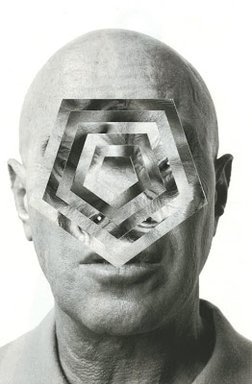
Artist Anaylsis - Gordan Magnin
Los Angeles-based artist, Gordon Magnin, produces work that is a perfect combination of his education, talents, and environment.
|
|
|
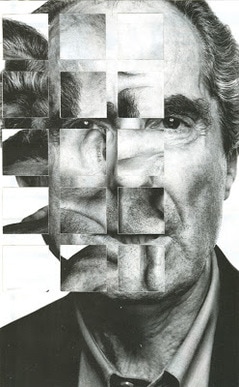
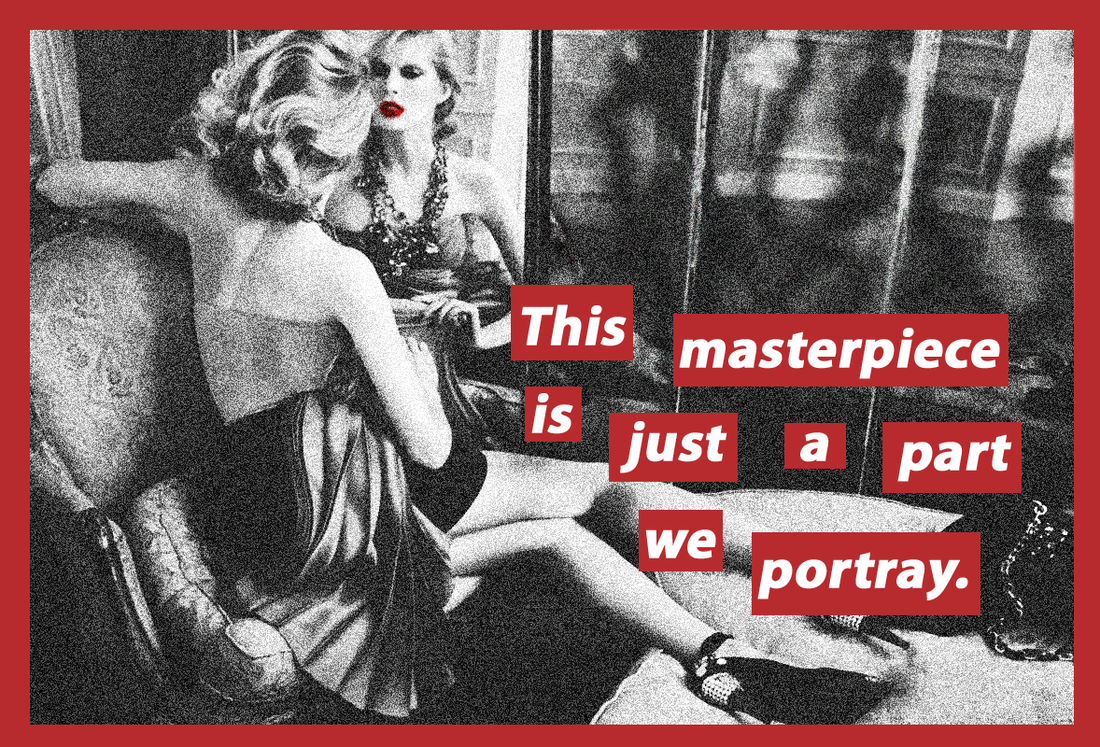
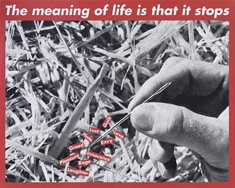
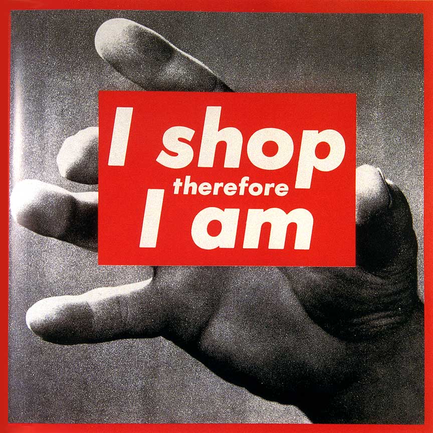
Artist Analysis - Barbara Kruger
Barbara Kruger (born January 26, 1945) is an American conceptual artist. Much of her work consists of black-and-white photographs overlaid with declarative captions.
Force Related Images
My Response to Force
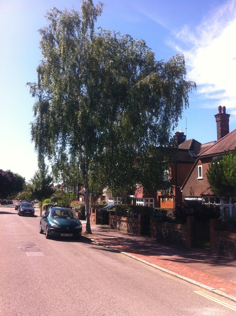
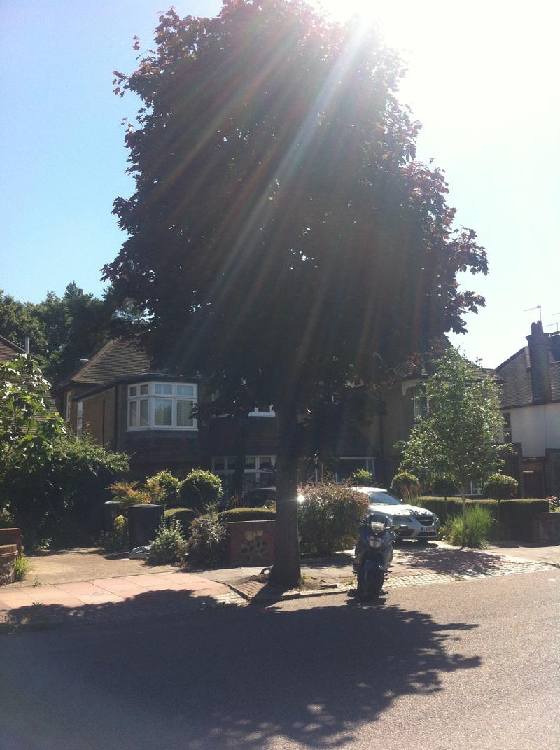
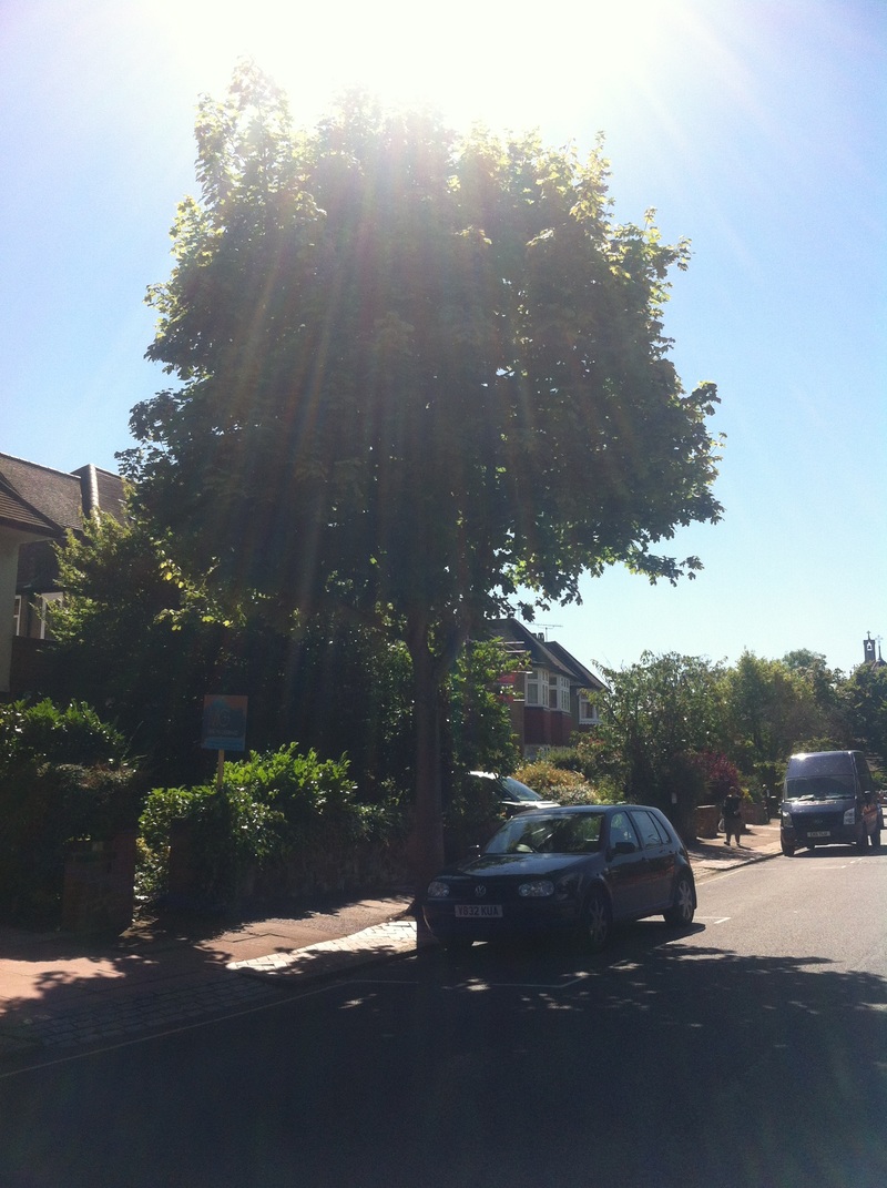
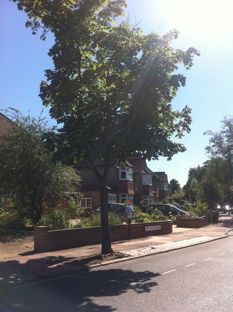
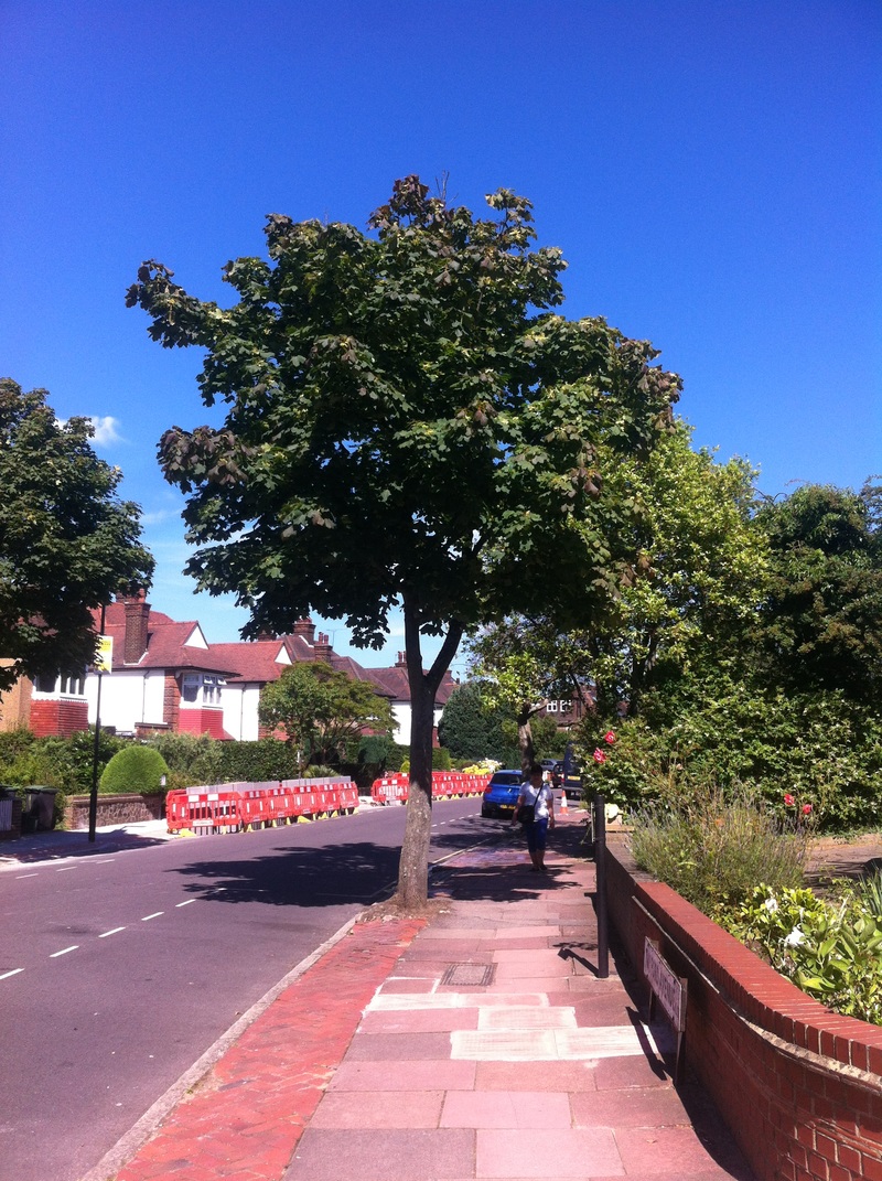
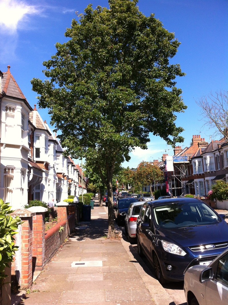
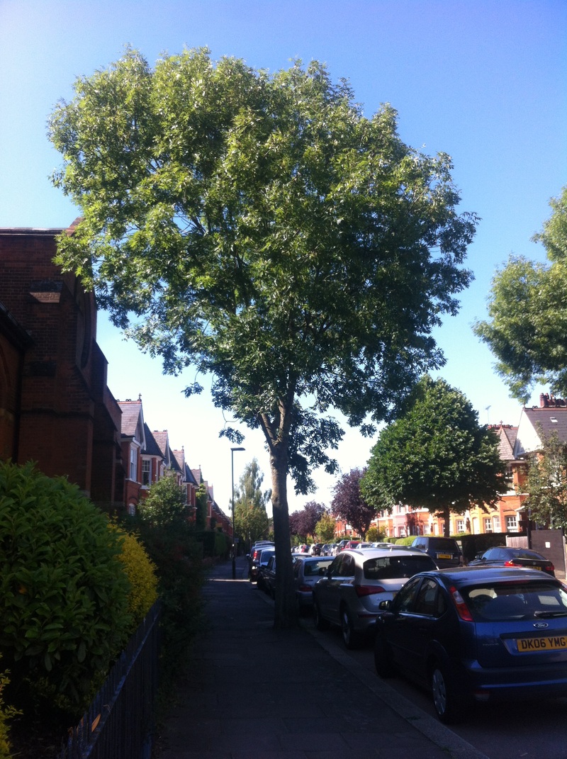
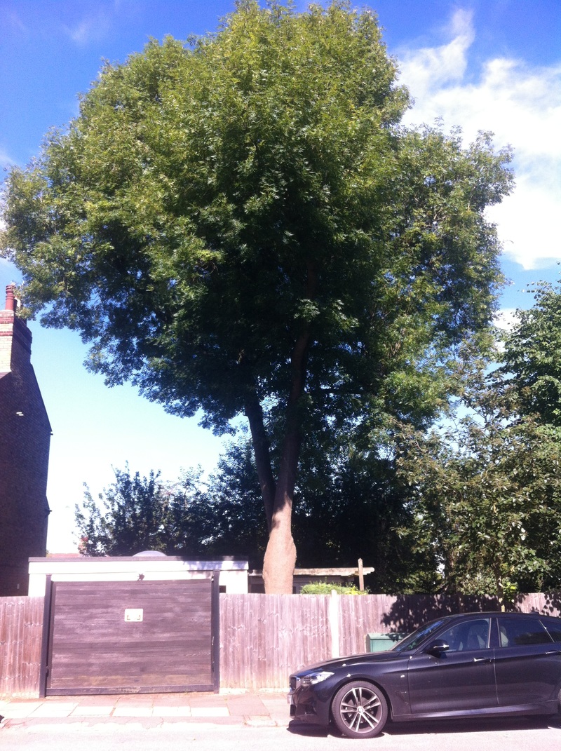
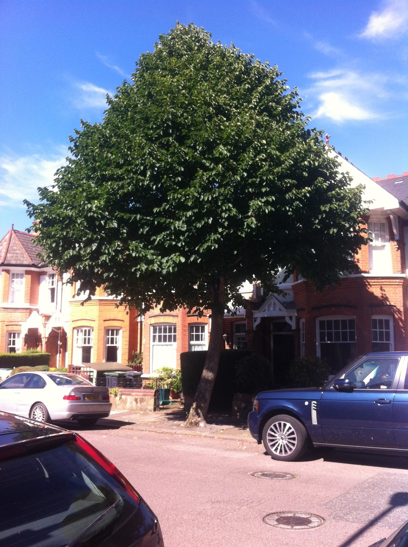
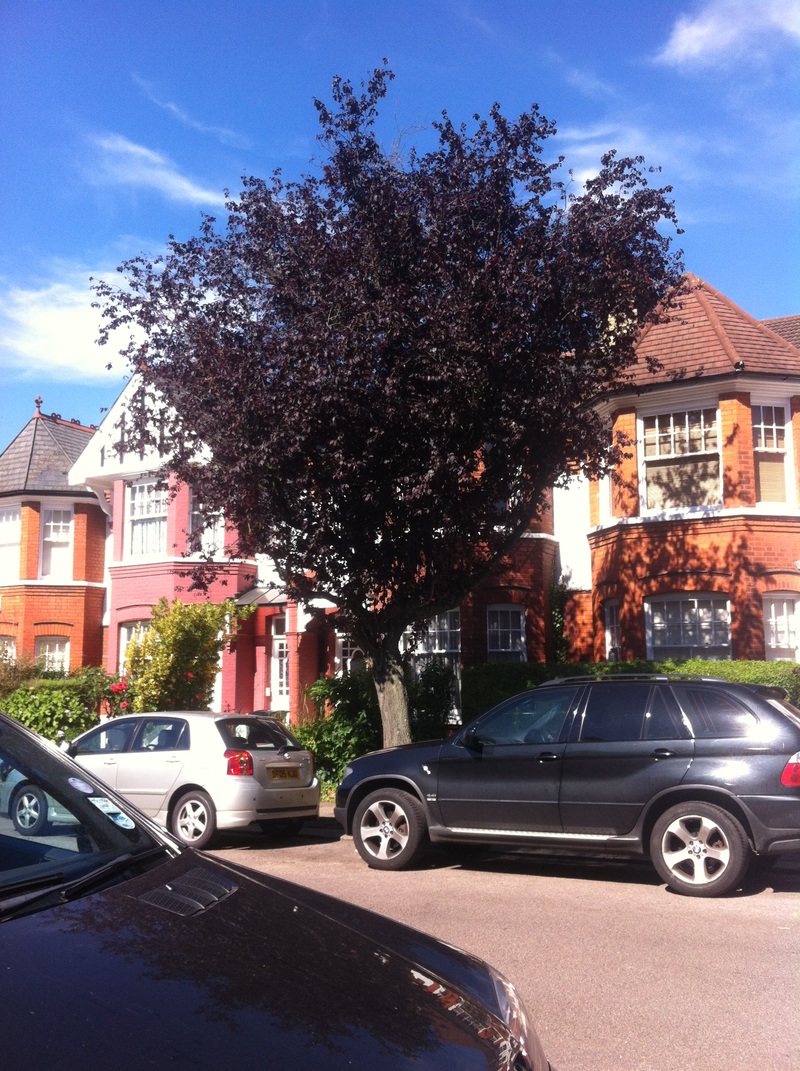
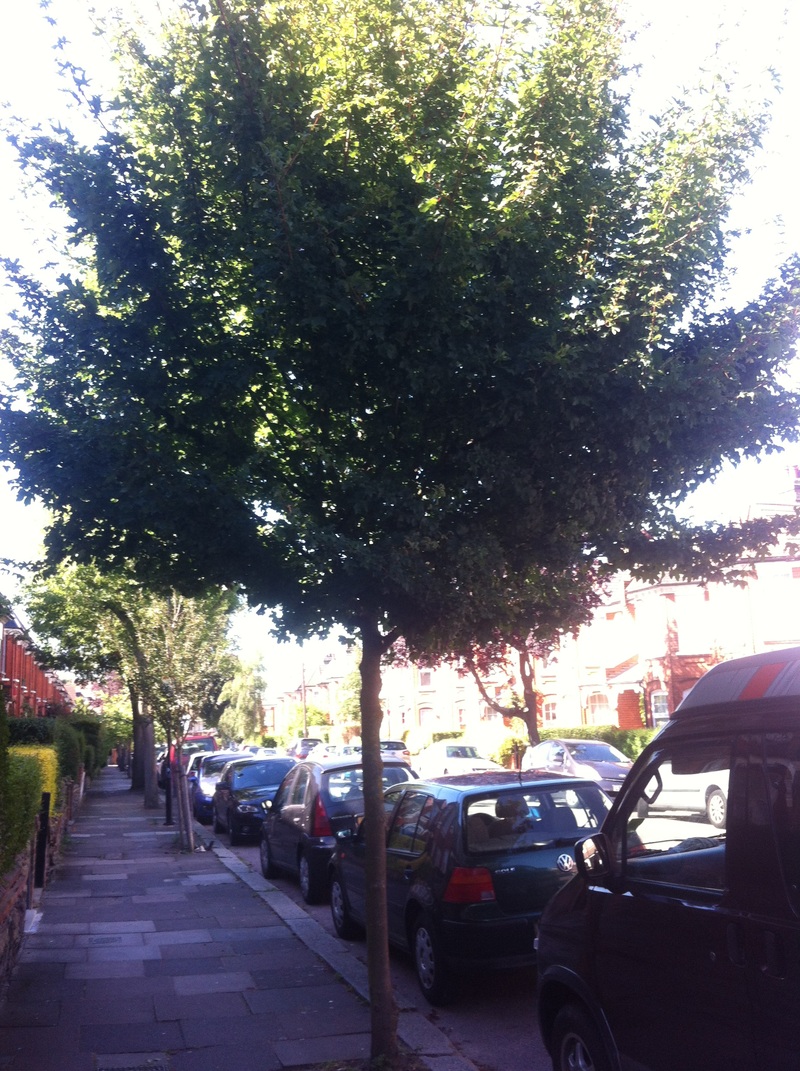
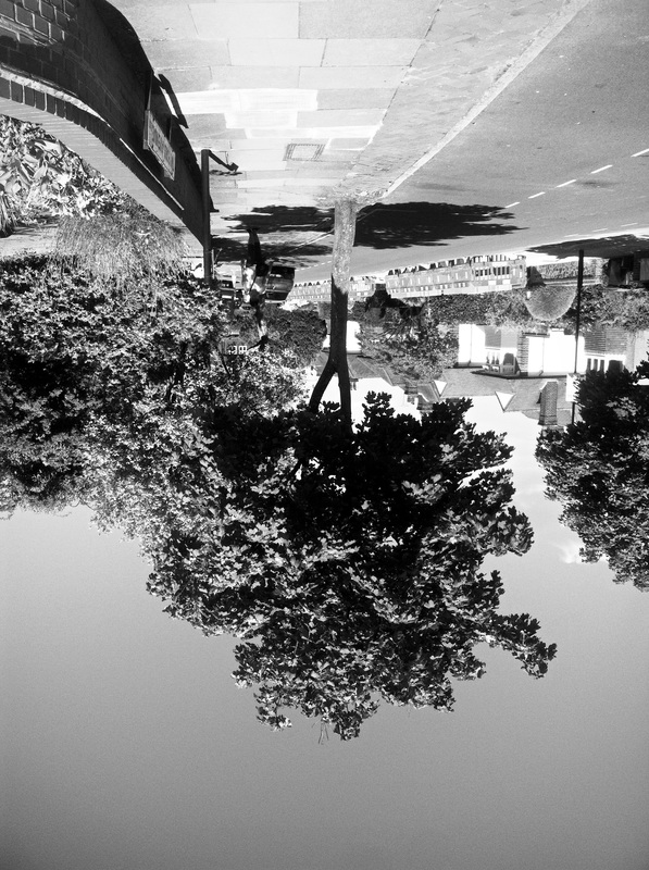
I interpreted the theme by thinking force is do with growth over man made objects. As you can see in the images below, a lot of them have been shot with natural materials growing over concrete or other human materials.
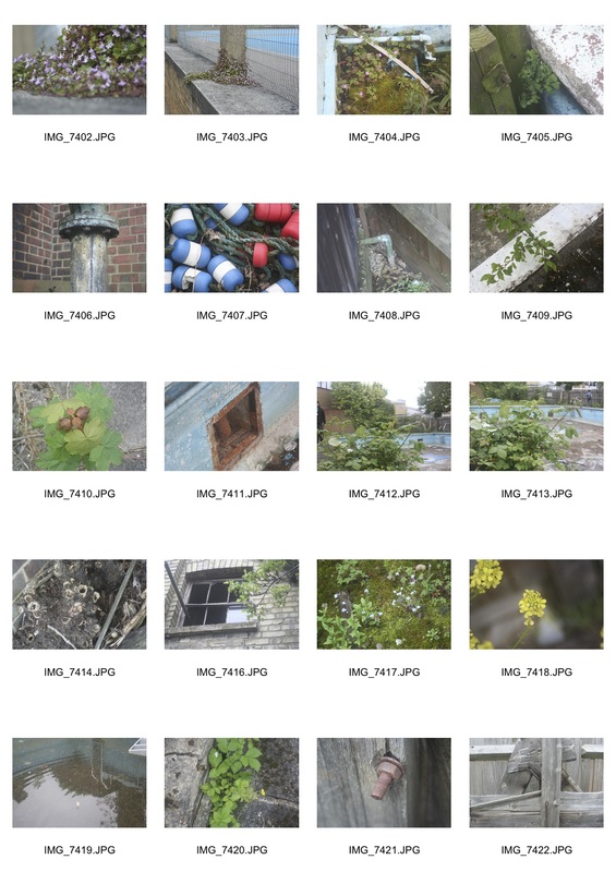
WWW: I think that I have used good subjects of images for example the exposure in a few of them is good as I have focused on one object to make it the main subject of the image. Also, I think in some of the images, I have used a good range of colours to create a positive effect on the image. I think I have responded well to the theme by showing effects such as overgrowth, pressing and strain.
EBI: I think that I need to work on making the subject of the image more about it. This is meant as saying I need to take photos that tells the observer that something is the clear subject of the image and this is what topic is about. In some of the images, Force is not shown. This can be improved by showing new types of force in my photos.
EBI: I think that I need to work on making the subject of the image more about it. This is meant as saying I need to take photos that tells the observer that something is the clear subject of the image and this is what topic is about. In some of the images, Force is not shown. This can be improved by showing new types of force in my photos.
Artist Analysis - Nadav Kander
Nadav Kander (born December 1, 1961) is a London-based photographer, artist and director, known for his portraiture and landscapes. Kander has produced a number of books; had his work exhibited widely; he received an Honorary Fellowship from the Royal Photographic Society in 2015, won the Prix Pictet and a World Press Photo award; and his work is included in the collections of the National Portrait Gallery, the Société Générale, Paris, Pictet & Cie’s Art Collection and other museums and galleries.
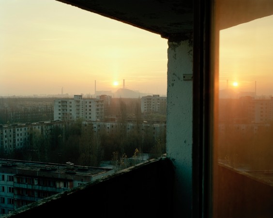
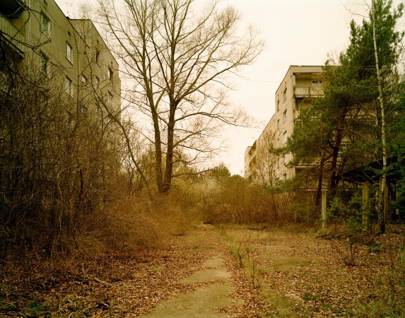
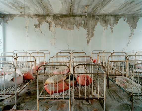
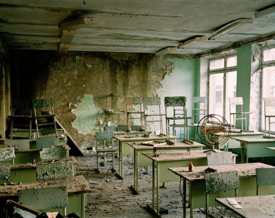
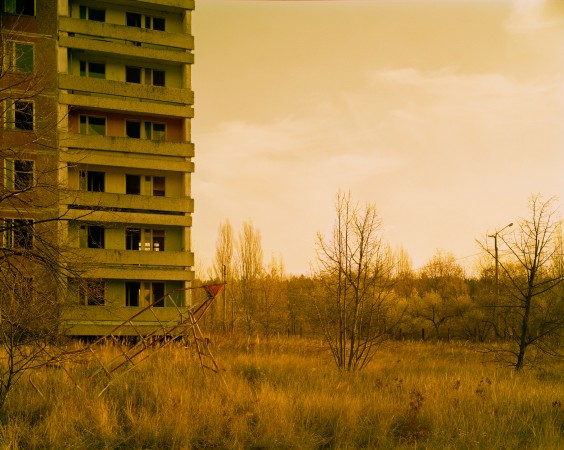
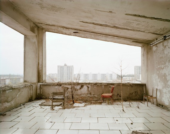
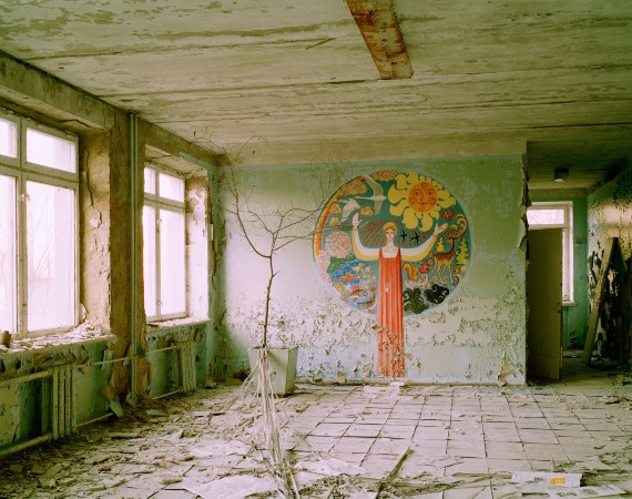
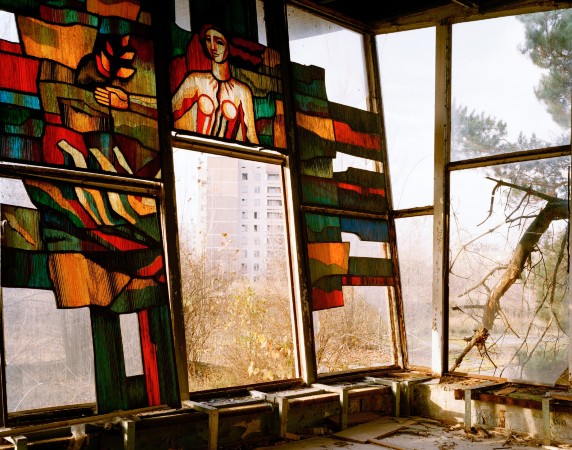
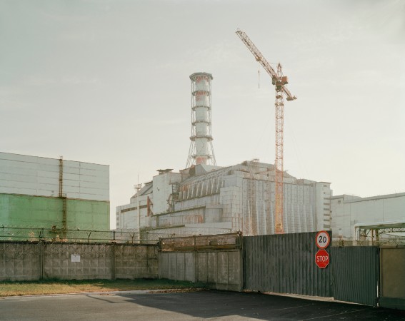
Kander intended to recreate the scenes of chernobyl. He did this by showing the overgrown plants and eyesore scenes after the nuclear disaster. He wanted us to imagine the destruction scenes during the event and want to make us realise the strength of the disaster. Kander has manipulated the formal elements so that parts of the landscape look like green lands and wasteland. The way he has used the lighting gives a sense of scale to the image. For example the 5th image to the right on the top row of the gallery below really shows the effect the nuclear spill has on Chernobyl. The trees and the greenery have been dried up and the building has been abandoned and run down over time.
‘Chernobyl- Half Life’ by Nadav Kander
"Reactor No.4 at Chernobyl's Nuclear Power Station exploded in 1986 leaving the surrounding area uninhabitable for many hundreds of years. I visited Chernobyl to mark its 20th anniversary, photographing the deserted spaces in what was once a model Soviet City.
Home to more than 40,000 people, the apartments, schools and hospitals that were hastily left following the controversial evacuation are stark reminders of past lives, leaving a disturbing sense of quite. An uneasiness that I had never previously experienced." - Nadav Kander
One of the dictionary definitions of half-life, a concept from nuclear physics, says it is "the time required for half the quantity of a drug or other substance deposited in a living organism to be metabolised or eliminated by normal biological processes". Confronted by the visibly stagnant rotor blades of contaminated military helicopters, the desolate logs that have the double distinction of being eaten up by both time and radioactive elements, or an arid, harshly lit sleeping room of an abandoned kindergarten, you are not left in two minds about humankind’s capacity for self-destruction.
In a video interview with the National Portrait Gallery, Kander said: "For me, the only interest is to express one’s self, one’s view, leaving enough questions unanswered. In any frame that I take, people can respond in their own way and tell their own stories."
What are Nadav Kander’s intentions?
Kander intended to frighten the viewer. He did this by shooting photos that were supernatural scenes and objects that have overgrown into rooms and old buildings. He wanted us to realise the mass destruction of this tragic disaster.
What wider social, political or cultural issues is/was the artist addressing?
Kander is considering nuclear explosion in Chernobyl in 1986 in this piece of work. The abandoned buildings show the panicked evacuation of the city. He wanted to explore nuclear disaster.
Nadav Kander: Chernobyl 1996
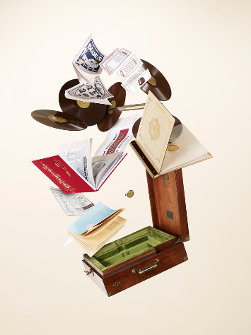
Deconstructing Objects
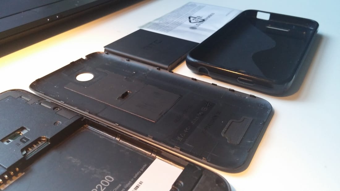
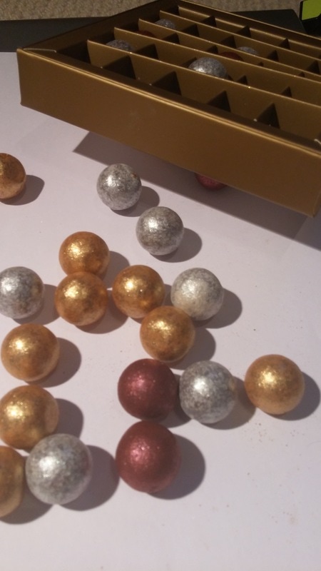
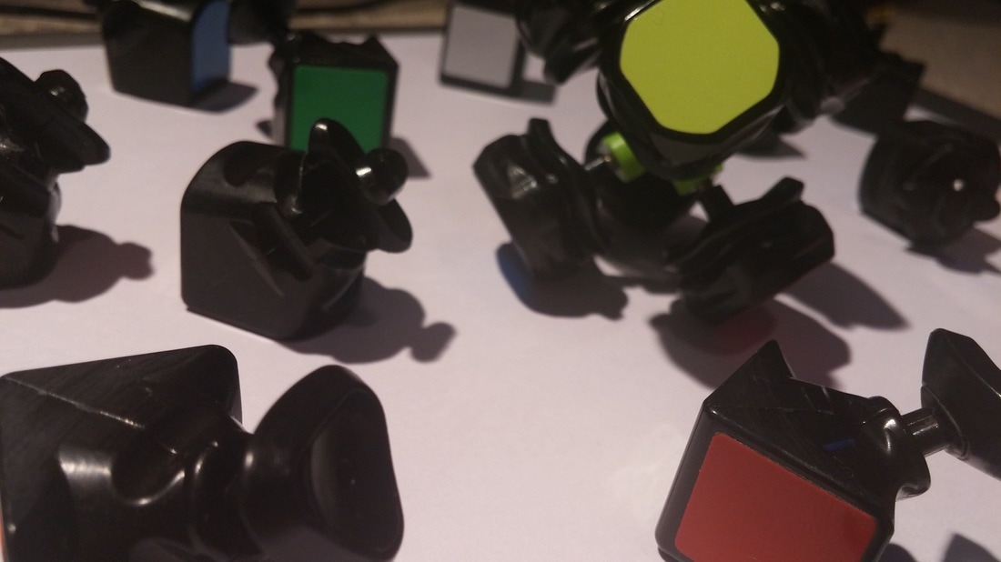
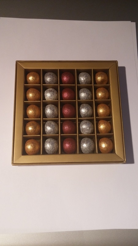
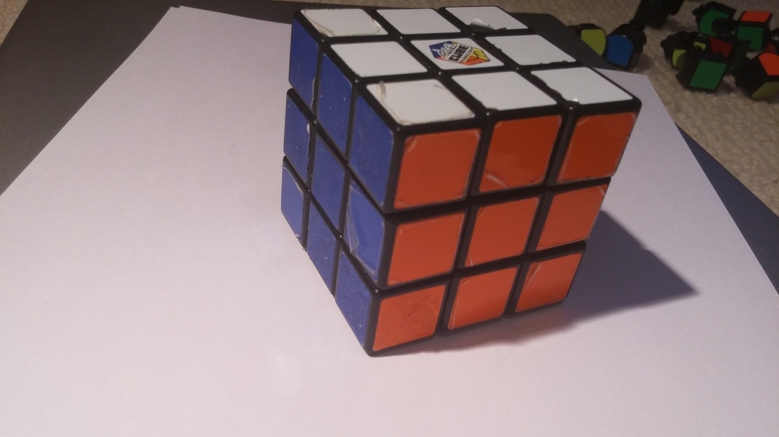
In this task, we were asked to take apart objects and photograph them in an orderly fashion and mixed together. As you can see below, I have taken apart my old HTC 510 smartphone, a box of chocolates and a rubiks cube.
From doing this experiment, I can now appreciate the complexity of deconstructing objects.

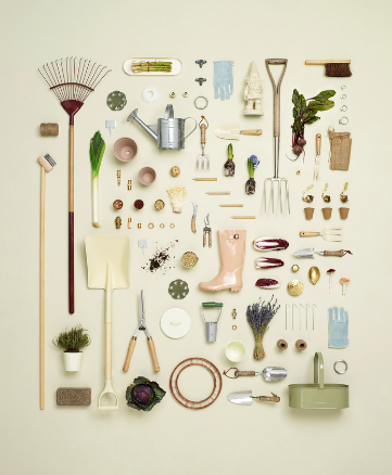
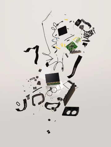
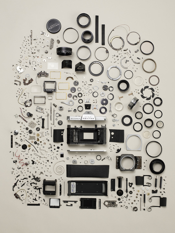
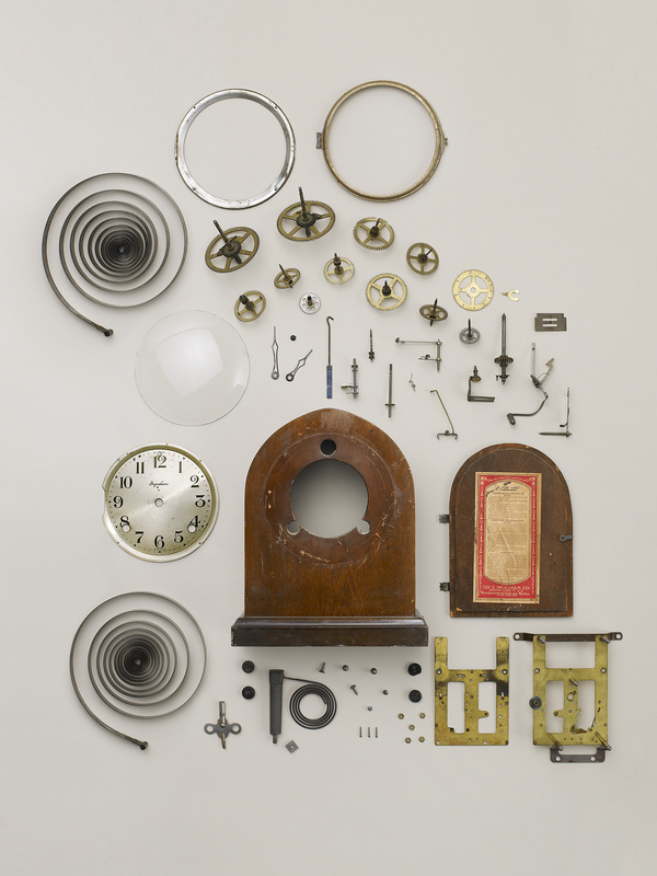
Artist Analysis - Todd McLellan
Todd Mclellan is a motion photographer. One of his project is called ''Things come apart". Things Come Apart is a series that explores retro to modern daily items that have, are, or will be in our everyday lives.
McLellan intended to disassemble objects to create a messy, deconstructed way. He did this by taking apart off the different parts of an object and spreading them out in an orderly fashion. He wanted us to appreciate the complexity of deconstructing objects.
Applied Force
In this task, we were asked to destroy objects using different methods such as the ones below. I have used apples, plastic bags and balloons to experiment with these methods. This links to force as it is demonstrating many ways of how to deform original objects by the effect of force e.g. Pressing, Crushing and Exploding.
Crush
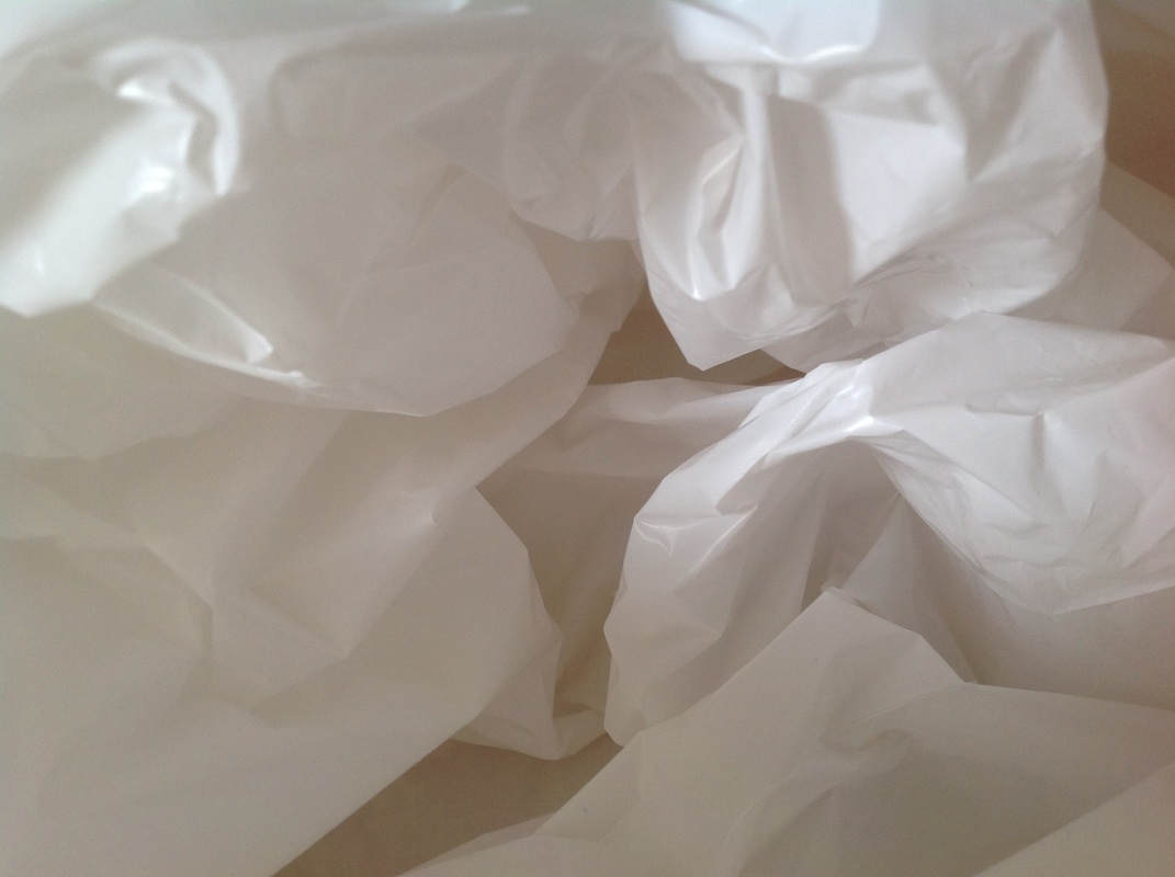
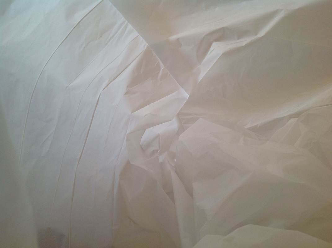
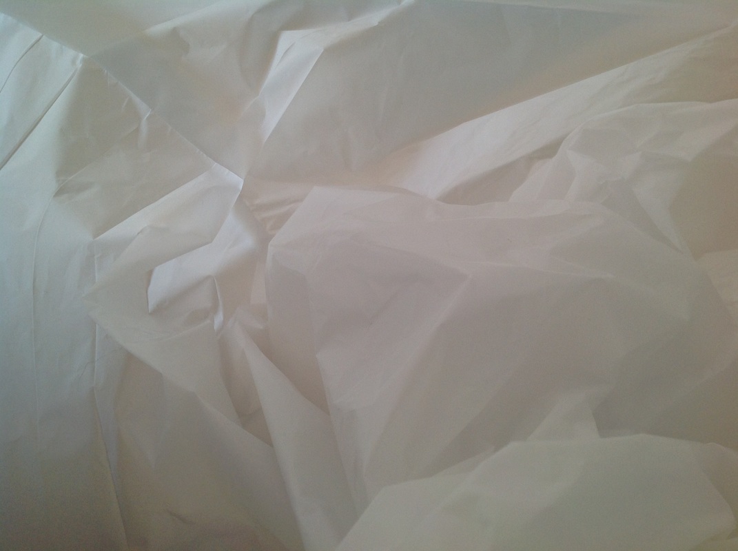
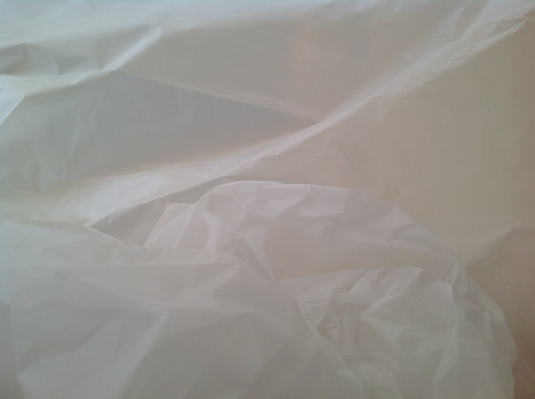
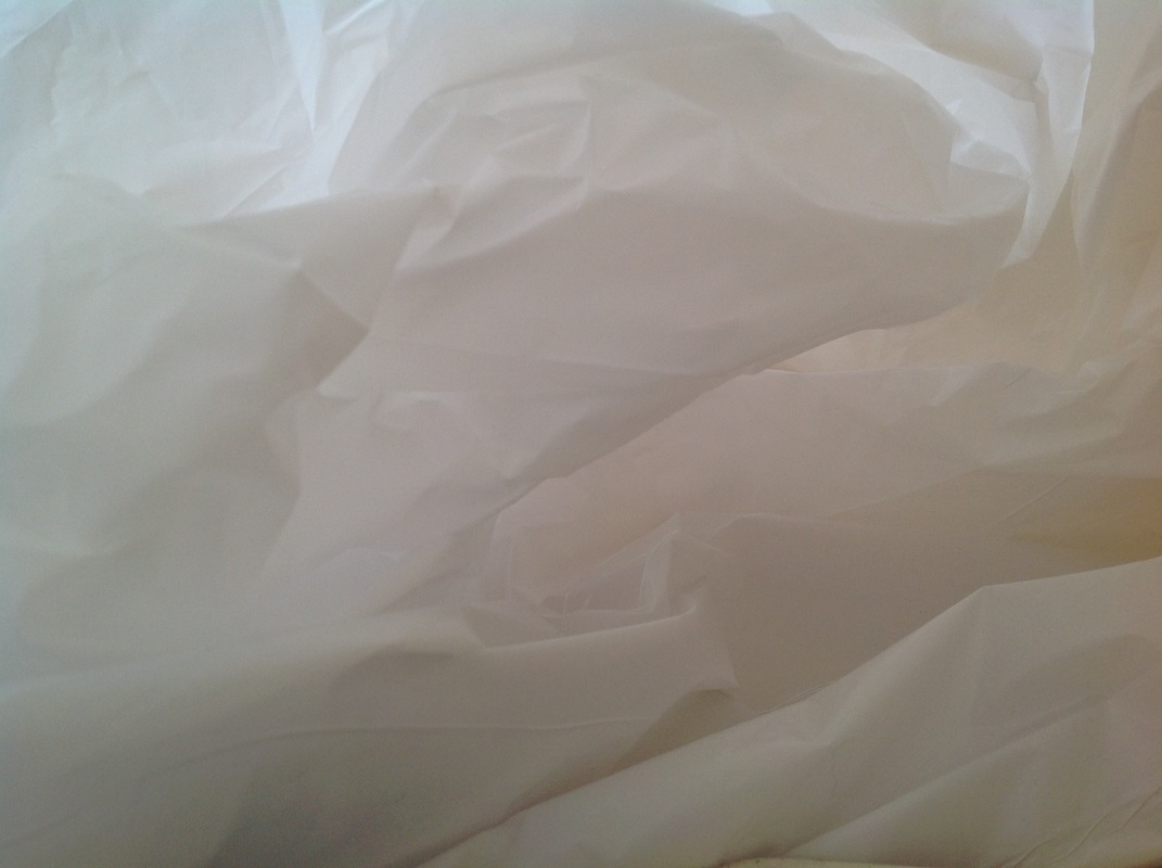
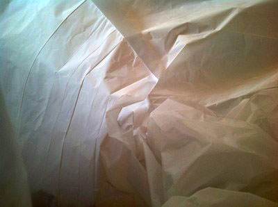
Artist Analysis - Francois Delfosse
Belgian architect Francois Delfosse, captures abstract images of the inside of plastic bags, trying to recreate images of caves or glaciers. He says that the images were taken in a "glacier cave just North of the South Pole", before adding that they are "viewed from the inside of a plastic bag".
Francois Delfosse has photographed what at first seems like an icy landscape but after closer inspection we start to see that he is actually photographing a white plastic bag. He says that they were taken in a "glacier cave just North of the South Pole", before adding that they are "viewed from the inside of a plastic bag". By focusing on form, texture, lighting and colour he has managed to reinvent an object and photograph it in a way that completely throws the viewer off, without actually changing the form of the plastic bag.
Instead of focusing on a passageway this image concentrates on mounds of snow. The texture of the bag makes it look as if the snow is settled and is being sculpted by the wind. The lighting casts shadows that give form to the front facing walls of the plastic bag. They start to look life steep cliff faces, which then give a sense of scale to the image. It starts to resemble some of Ansel Adams photographs of the National Parks.
What are Francois Delfosse’s intentions? There may be more than one. ‘PEC’ each intention.
Delfosse intended to recreate.He did this by using the placements of the bag to create shadows in the glacier.He wanted us to us to imagine that we were in a glacier.
How does Delfosse manipulate the formal elements (form, texture and colour) to create this illusion ?
Delfosse has manipulated the formal elements so that parts of the bag look like mounts of ice and icicles.
The way he has used the lighting gives a sense of scale to the image. For example the shadows make the image seem larger and the glacier seem vaster. Delfosse’s work has been compared to Ansel Adams.
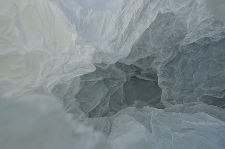
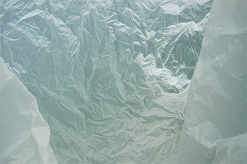
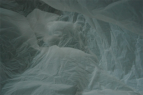
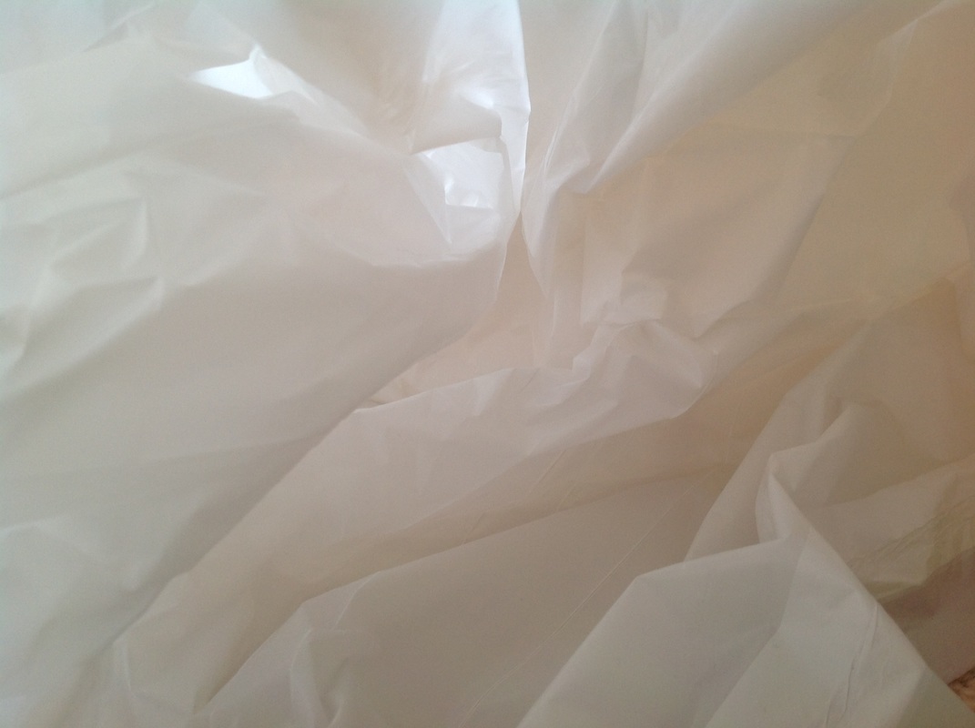
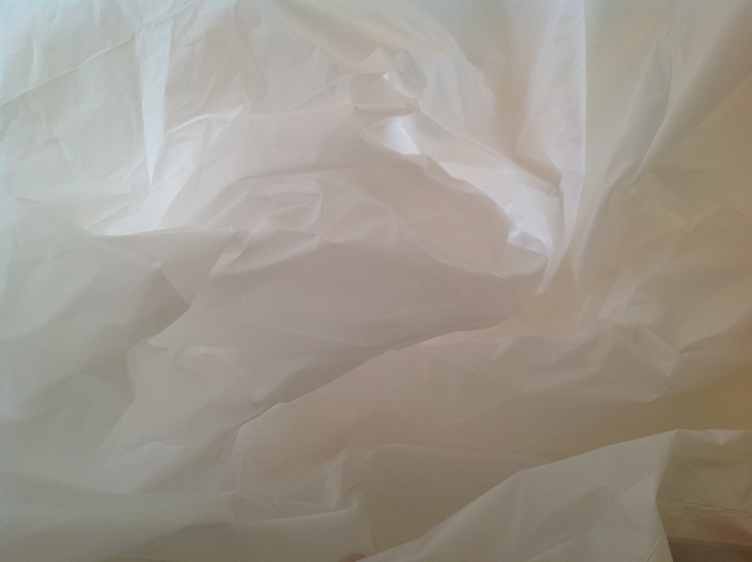
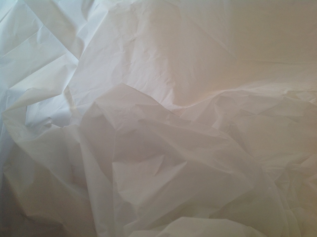
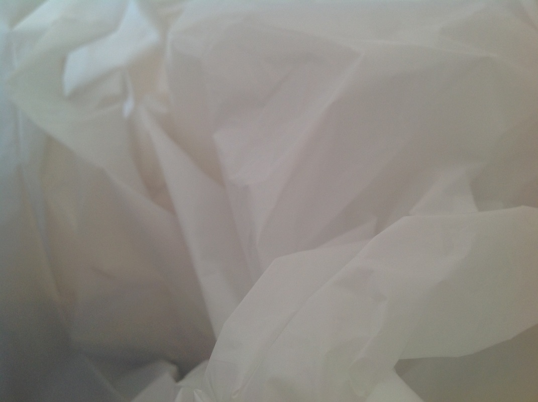
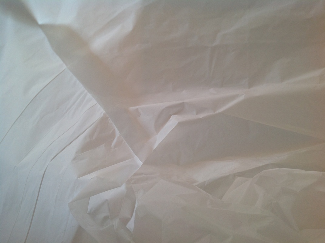
I used plastic bags to try and create the illusion of a glacier type environment. He has used shadow and light to form eroded and weathered glaciers. This makes the illusion look more realistic. Also the shadows create contrast agains the white bag which makes the atmosphere feel gloomy and never ending to the observer. Delfosse has used plain white plastic bags because he wanted it to look like the snow and ice. He has created blurred areas by focusing on the background- which gives dimension and makes the plastic bag seem like a vast landscape, rather than a small bag.
My Response to Applied Force


Three Edited Photos
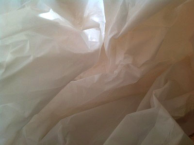
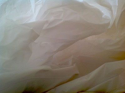
I used plastic bags to try and create the illusion of a glacier type environment. I have used plain white plastic bags because I wanted it to look like the snow and ice. I created blurred areas by focusing on the background- which gives dimension and makes the plastic bag seem like a vast landscape, rather than a small bag.
Artist Analysis - Ansel Adams
Ansel Easton Adams was an American photographer and environmentalist. His black-and-white landscape photographs of the American West, especially Yosemite National Park, have been widely reproduced on calendars, posters, and books.
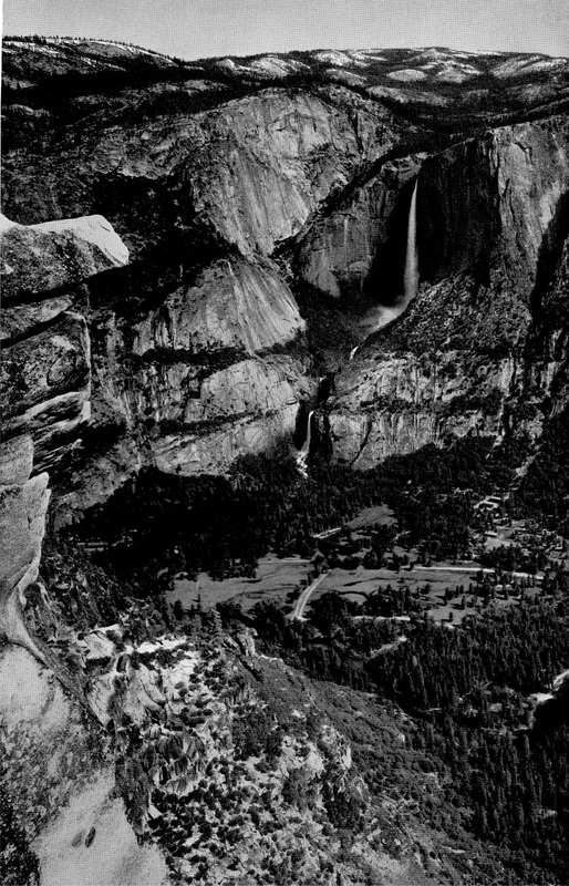
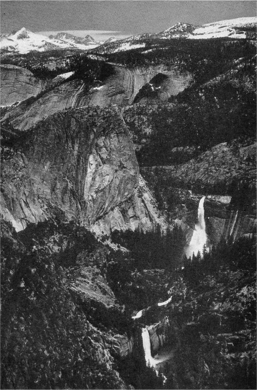
Ansel Adams compares to the work of Francois Delfosse because in both of the work of these photographers, they both create layers and textures of cave like images. The shadows in the plastic bags are similar to the glaciers by Ansel Adams because it creates a feel that you are there in the valley or glaciers.
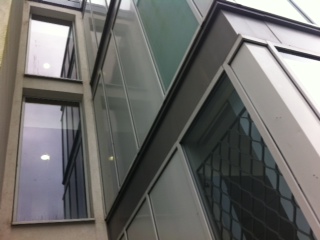
Imposing Architecture
First Response
Many artist and photographers have depicted imposing architecture such as factories, bridges, oil rigs, power plants, dams and wind turbines to reflect both the physical and visual impact of the places.
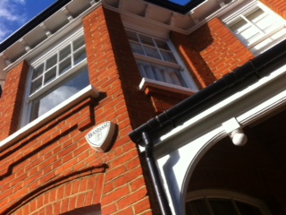
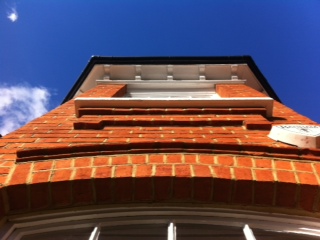
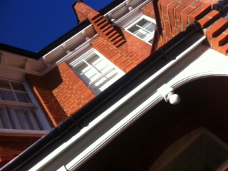
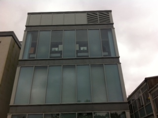
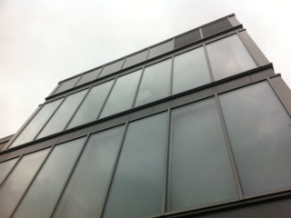
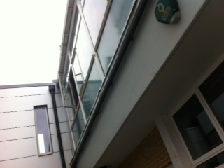
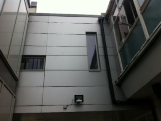
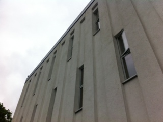
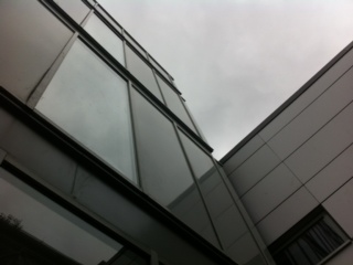
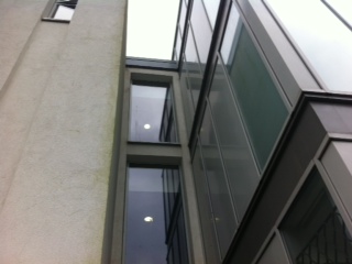
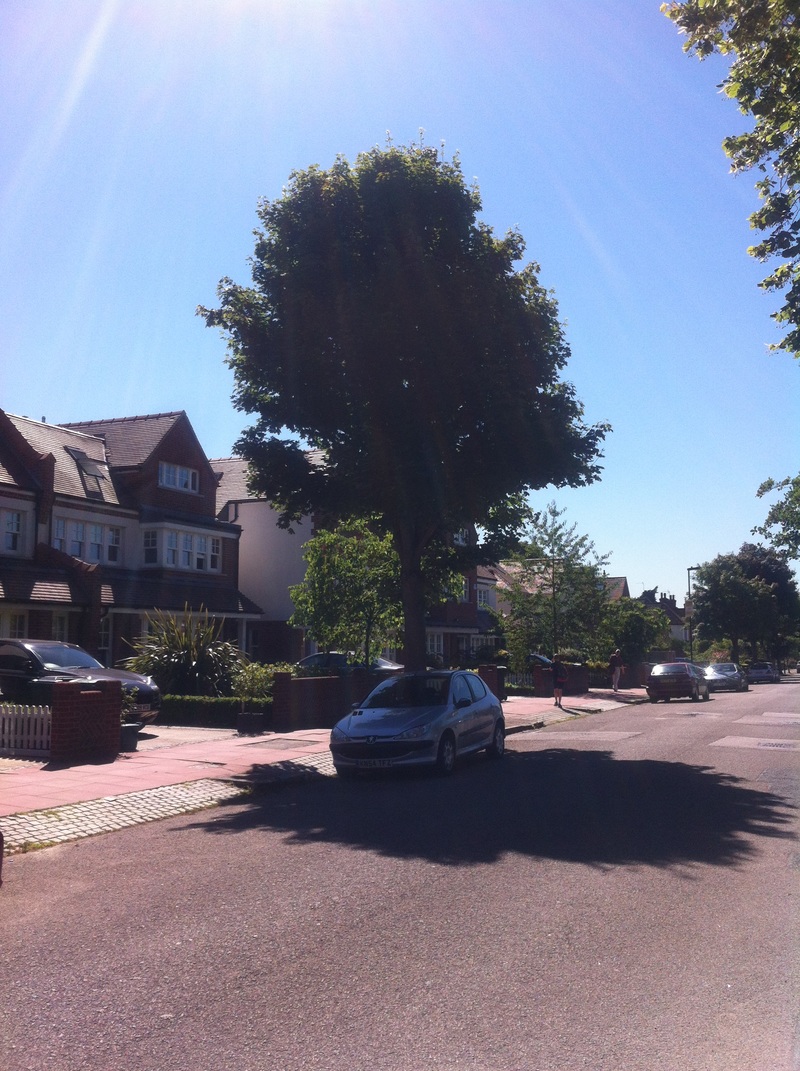
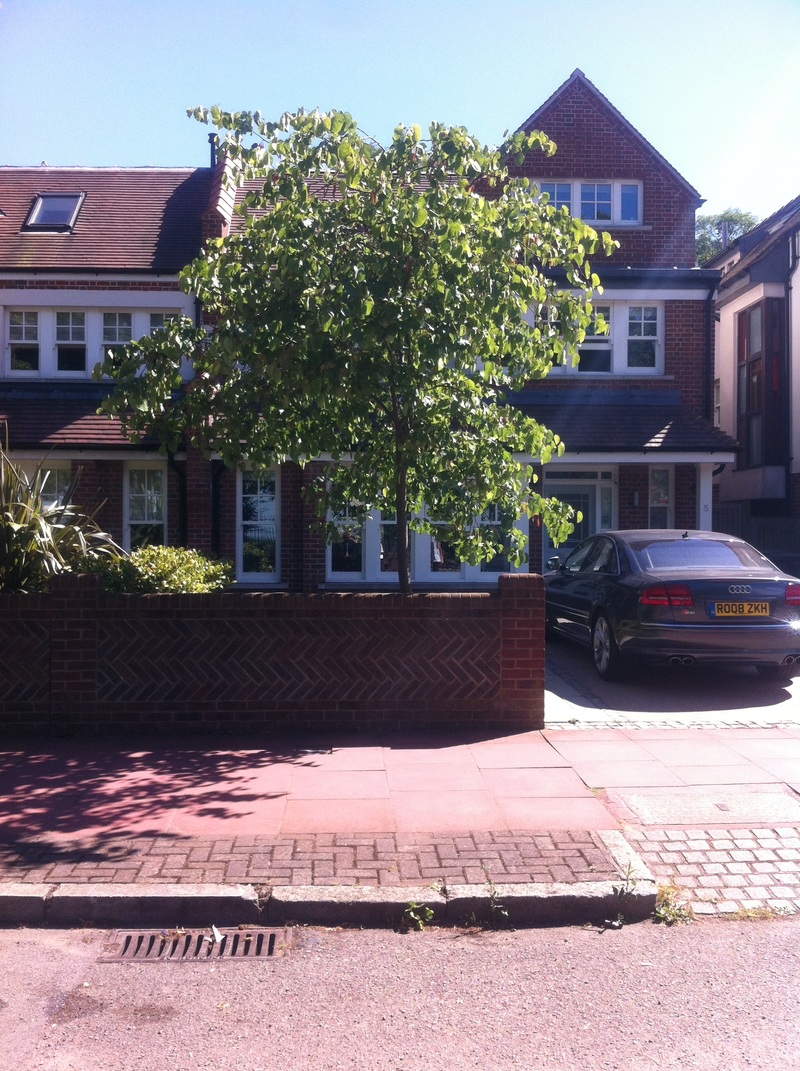
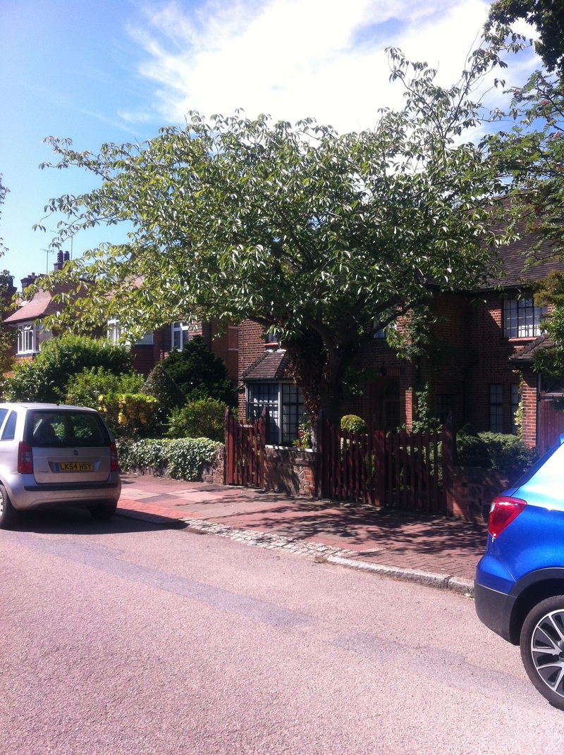
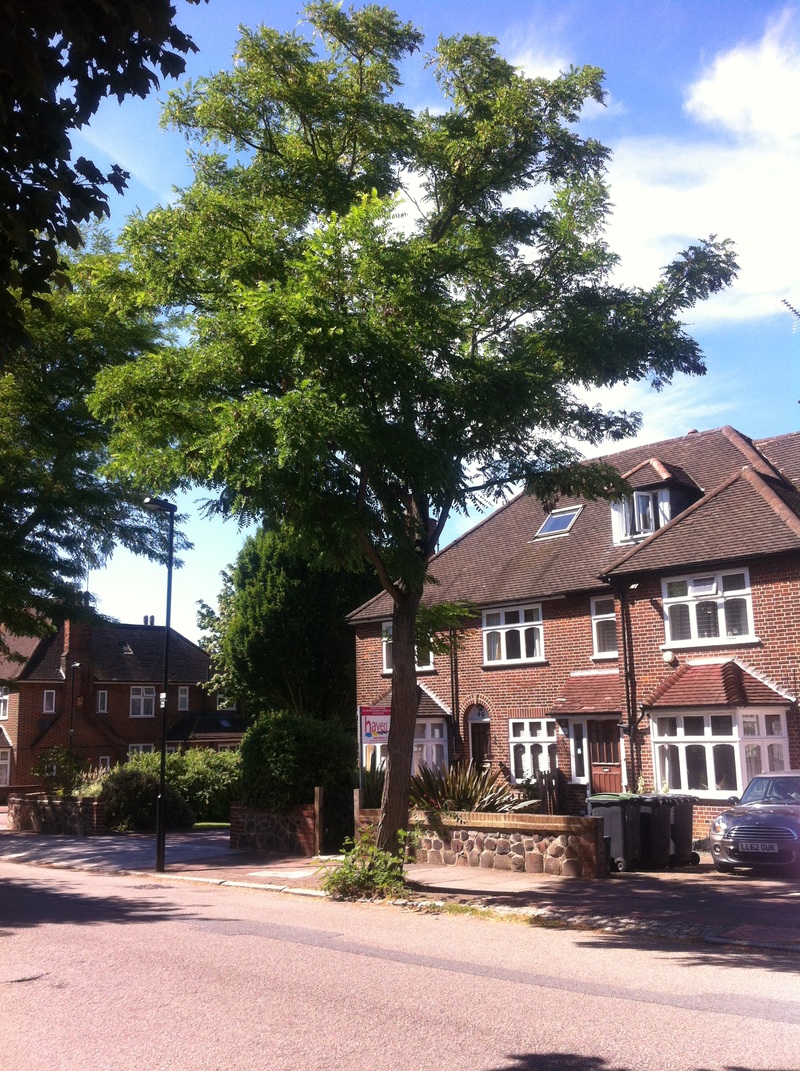
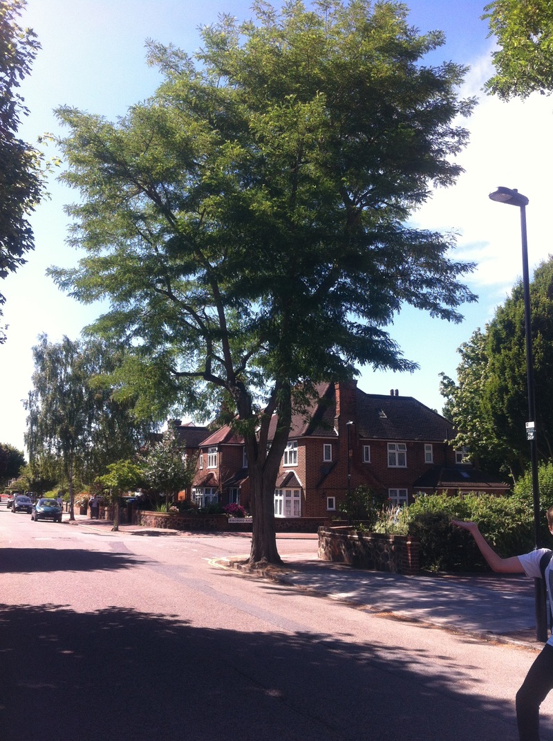
TASK: In this task, we were told to go out and find a building or structure that was good enough to take photos of. I have chosen a church as its a large structure and I am hoping to make the observer feel like this man made structure is vast and looming.
TASK: In this task, we were told to go out and find a building or structure that was good enough to take photos of. I have chosen a church as its a large structure and I am hoping to make the observer feel like this man made structure is vast and looming.
Second Response

Selected three best images

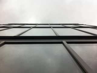

I have chosen these 3 photos for my final 3 because I think that these photos represent the best definition of force. The first photo I think shows the best variety of textures, patterns and sizes. The second photo I chose because I emphasizes the effect of size and overwhelm. finally, the 3rd photo is good because it shows a comparison of different objects in the infrastructure I photographed.
Three Strands
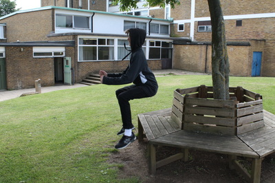
1st Strand - Force of Nature
Rodney Graham
Rodney Graham is an artist and musician born in Abbotsford, British Columbia. He is most often associated with the Vancouver School. He lives in Vancouver and is married to the artist Shannon Oksanen.
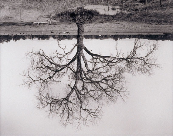
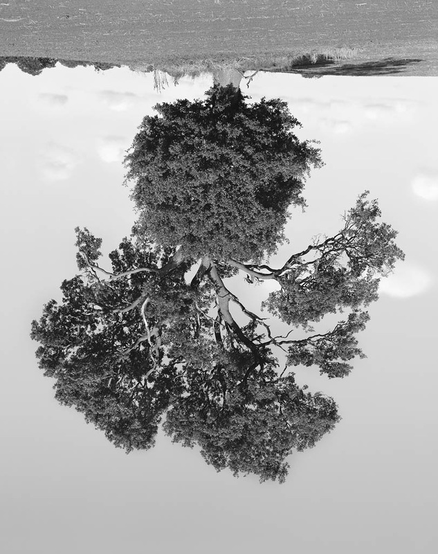
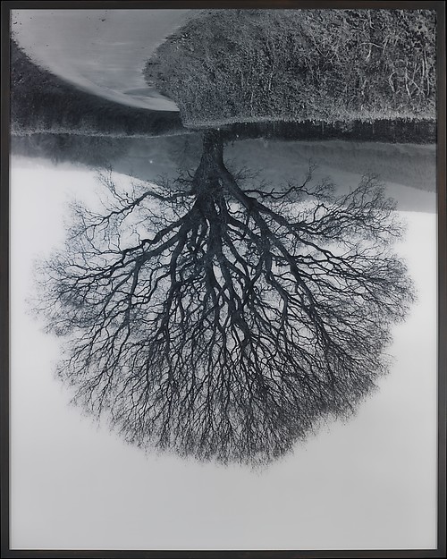
My Response
Selected and Edited Three
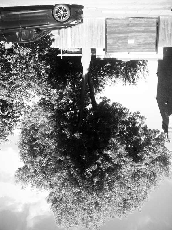
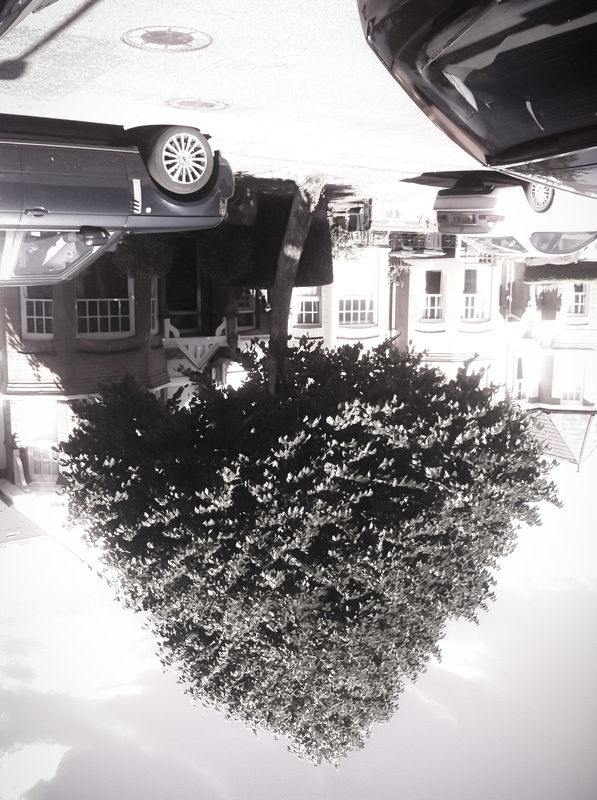
This is my response to my first strand, Force of Nature. These are my favourite 3 images because I think that these three are the best recreations of Rodney Grahams work. I captured these using a good exposure on my camera. I think that these photos are good because they have been shot in focus. To improve this task, I would use different environments to take a new set of images and hopefully this adjustment will make the outcome better. Also, as you can see in Rodney Graham, his photos were images of trees in an open environment. To improvemy work, I could try and capture some trees in fields and other open spaces to make them look more like Grahams.
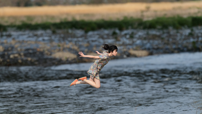
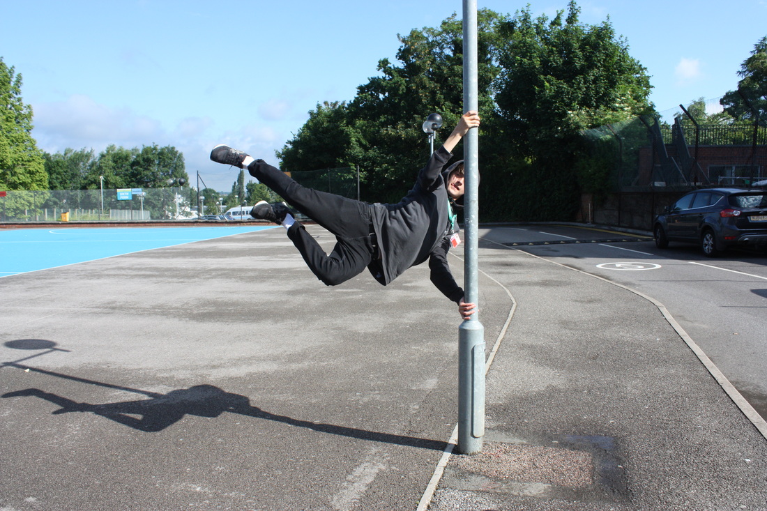
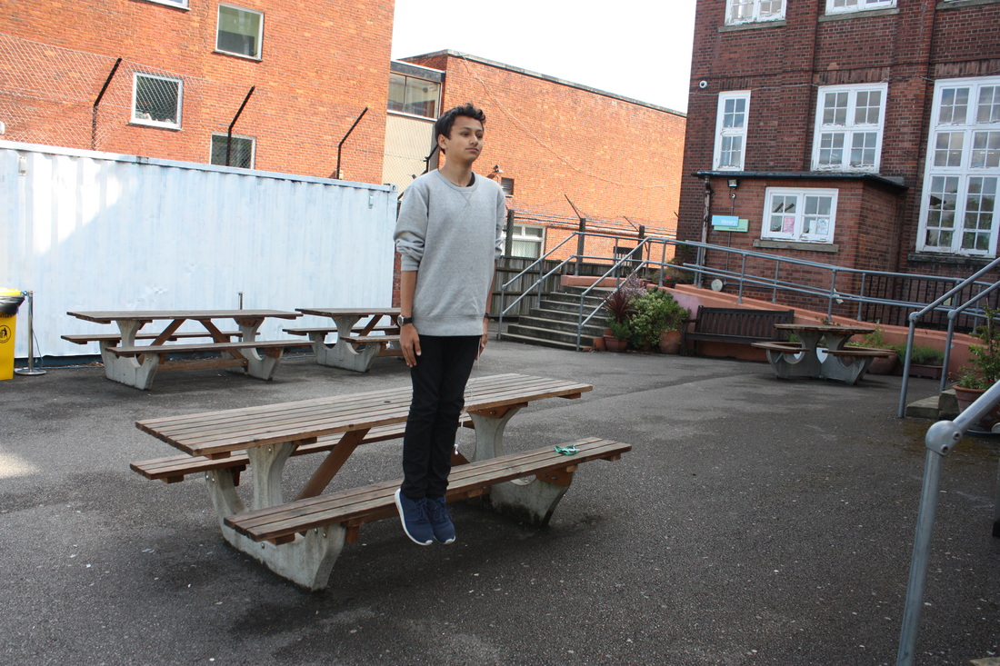
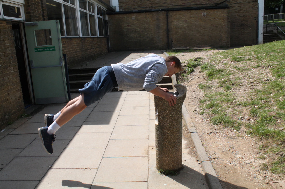
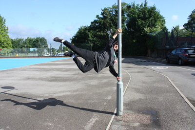
Second Strand - Force of Levitation
Yowa Yowa
Natsumi Hayashi is a Japenese photograher who photographs mainly levitating self-portraits.
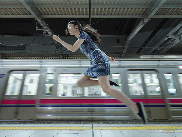
My Response
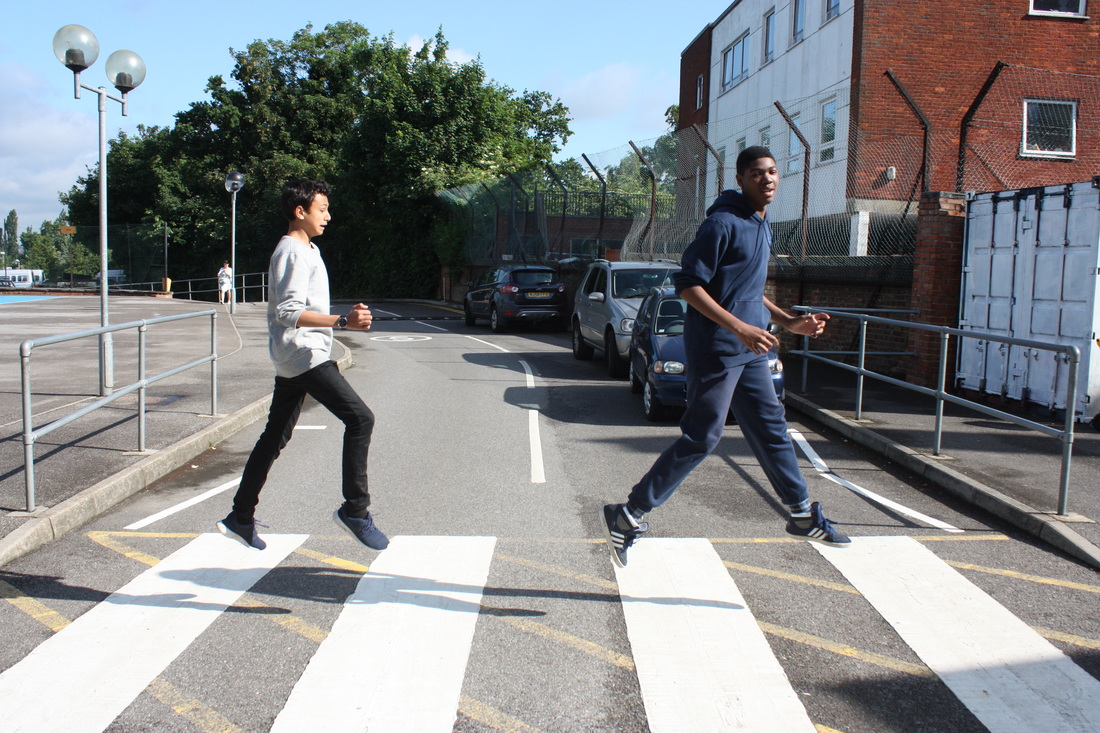
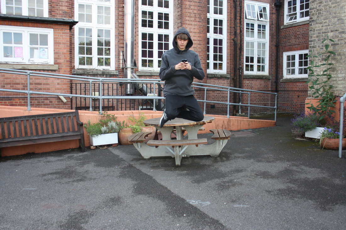
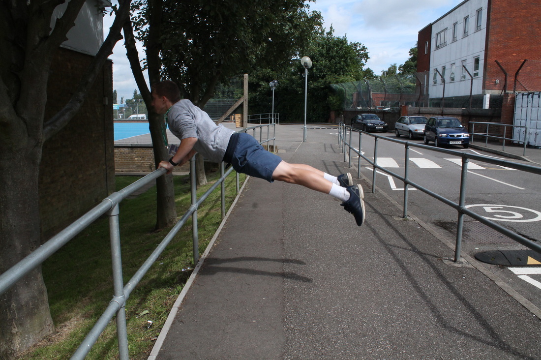

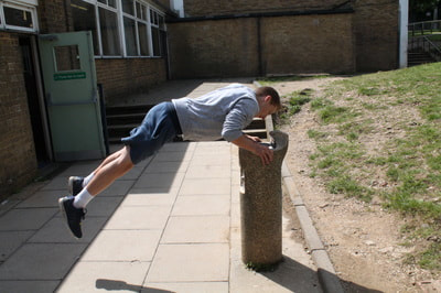
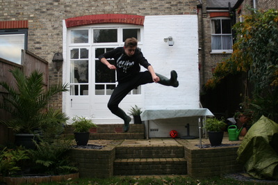
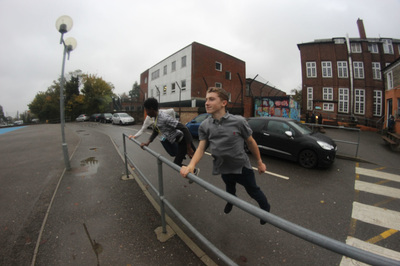
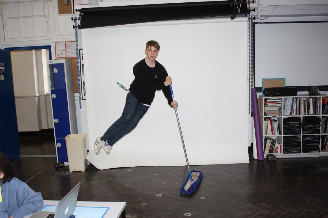
This is my response to my 2nd strand. I think that this is a good response to levitation because i have tried to use as many techniques as the techniques used by Yowa Yowa (shown above). To take these photos I used a fast shutter speed and a good exposure. Some of the photos I have taken have come out well and some not so well. This may be because I used a bad shutter speed or a bad aperture setting. Below are the three selected images that I Thought were my best three.
Selected Three
This is my response to my third strand, Levitation. These are my favourite 3 images because I think that these three are the best recreations of Yowa Yowa's work. I captured these using a shutter speed on my camera. I think that these photos are good because they have been shot in focus with a great exposure. To improve this task, I would use different environments to take a new set of images and hopefully this adjustment will make the outcome better.
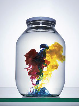
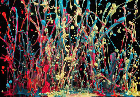
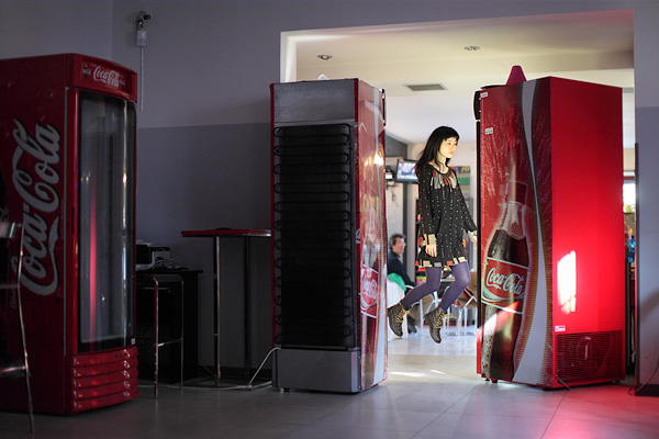
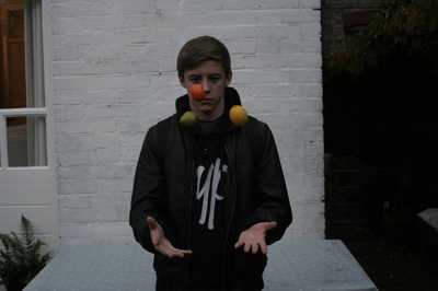
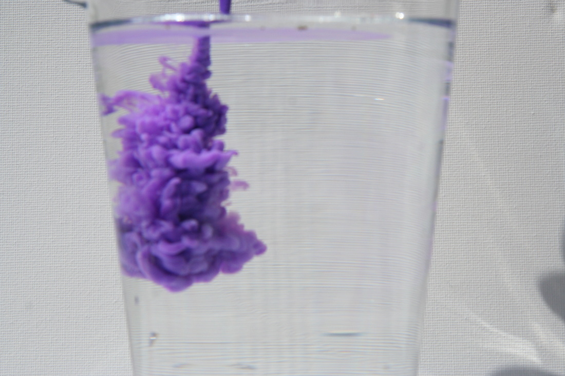
Third Strand - Force of Reactions
Dan Tobin Smith
Dan Tobin Smith has over a decade of experience working as a photographer specialising in installation and still life photography. His work has been commissioned by clients across the fields of fashion, music, publishing and advertising — from Numéro, Wallpaper*, Acne Paper and Document Journal; to Absolut, Alexander McQueen, Nike, Louis Vuitton and Johnnie Walker.
My Response
Best Three Images
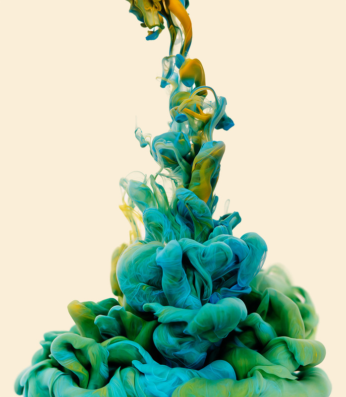
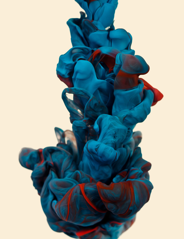
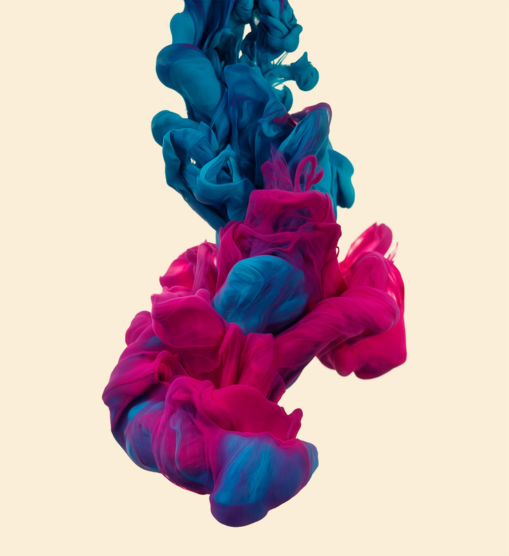
Artist Analysis - Alberto Seveso
Illustrator & Digital Photographer Alberto Seveso was born in Milan, he grow up in Sardinia but is now working and living in Bristol (UK) as a freelancer. His passion for graphic art started when he was in a young age and he was really fascinated by the graphic of skate decks and the cover of music CD of metal bands in the early ‘90s. From this passion he started to create his artworks. This is another artist that is linked to Force of Reactions.
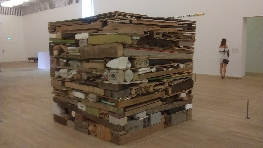
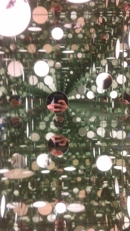
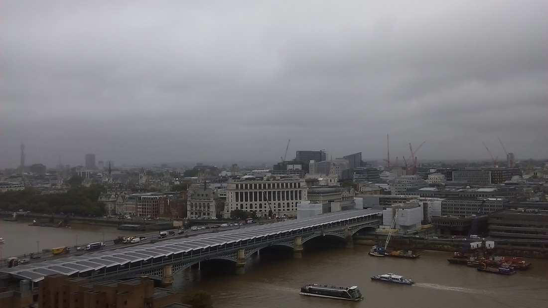
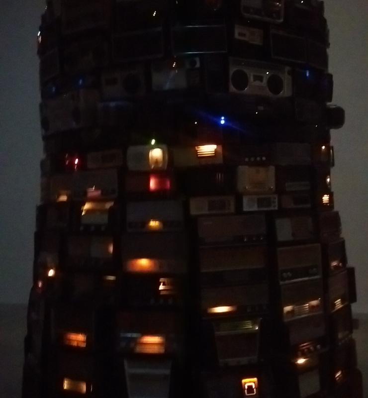
Exhibition Visit - Tate Modern
On Monday 5th September 2016, I visited the Tate Modern. Here are my photos from my visit. Alot of these are linked to photographers or artists that I have studied in topics.
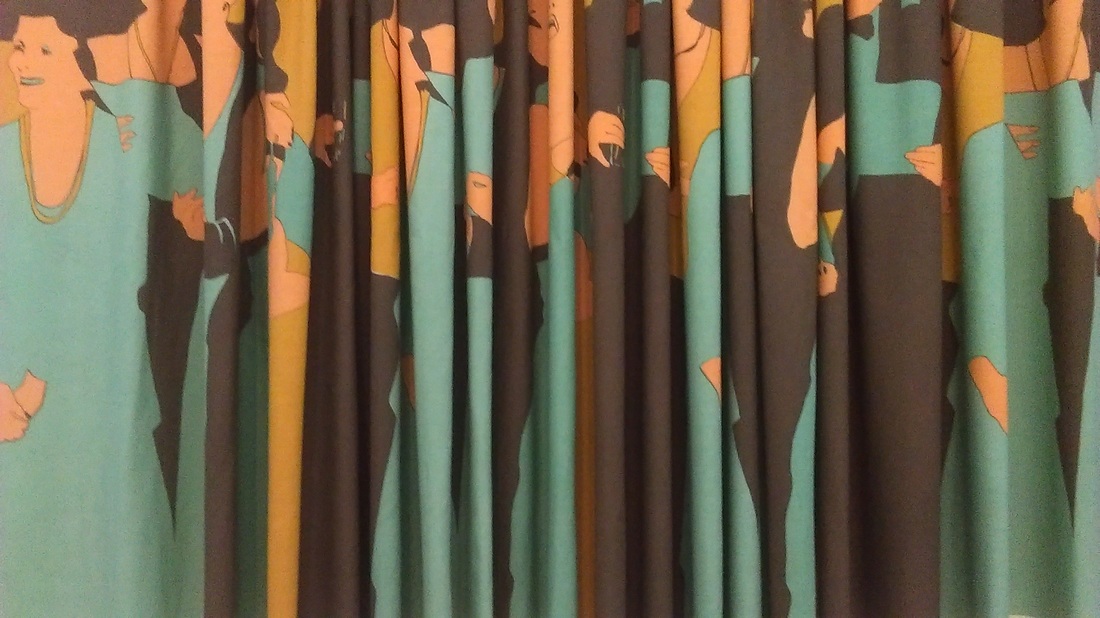
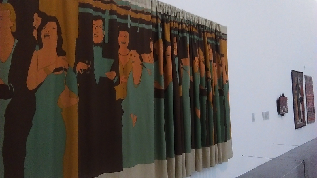
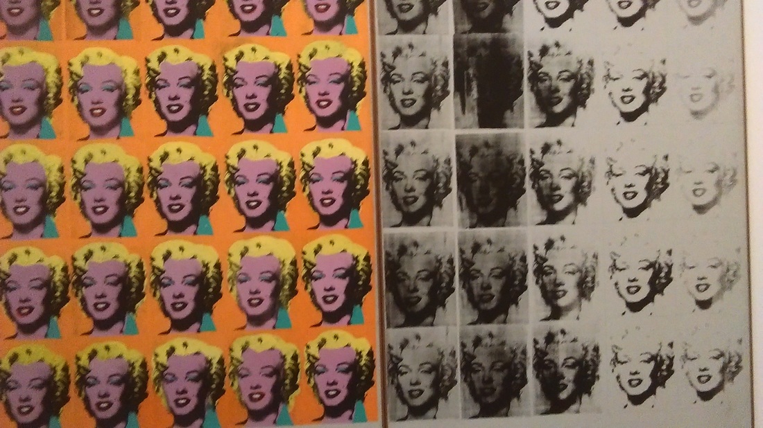
Andy Warhol: Marilyn Monroe
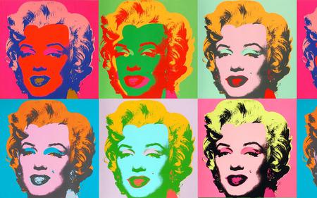
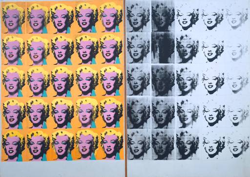
Marilyn Monroe died in August 1962, having overdosed on barbiturates. In the following four months, Warhol made more than twenty silkscreen paintings of her, all based on the same publicity photograph from the 1953 film Niagara. The contrast of vivid colour with black and white, and the effect of fading in the right panel are suggestive of the star’s mortality.
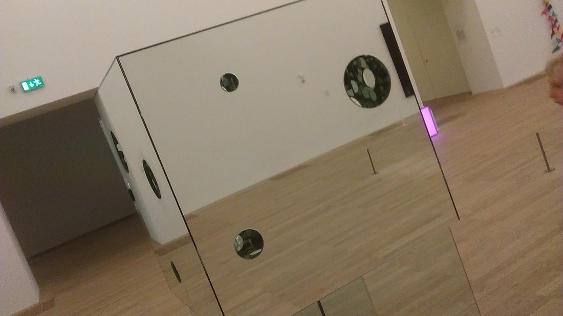
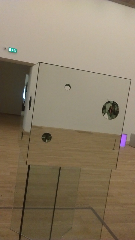
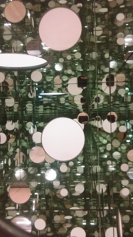
Yayoi Kunama: Passing Winter 2005
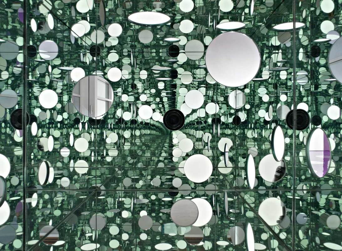
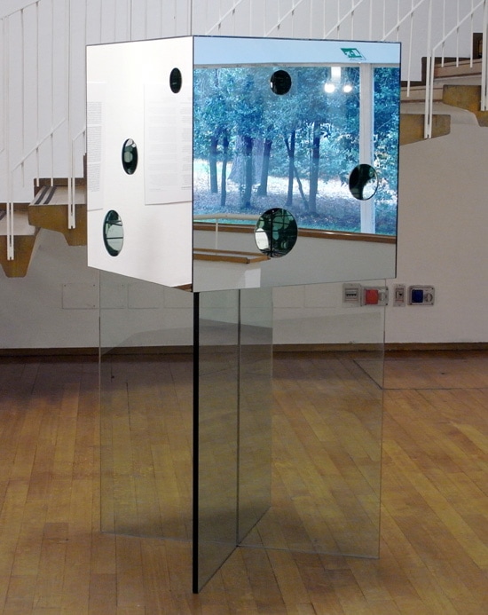
The Passing Winter 2005 is a sculpture comprising a cube positioned on two thick panes of glass, which are arranged to form an x-shaped pedestal. The cube, which is also made of glass, has an interior and exterior lined with mirrors, and its sides each contain three circular holes of different sizes arranged in varying compositions. Viewers are invited to look through these holes to the inside of the box and in doing so can see the circular shapes that are cut into the cube’s walls reflected infinitely across its mirror-lined interior.
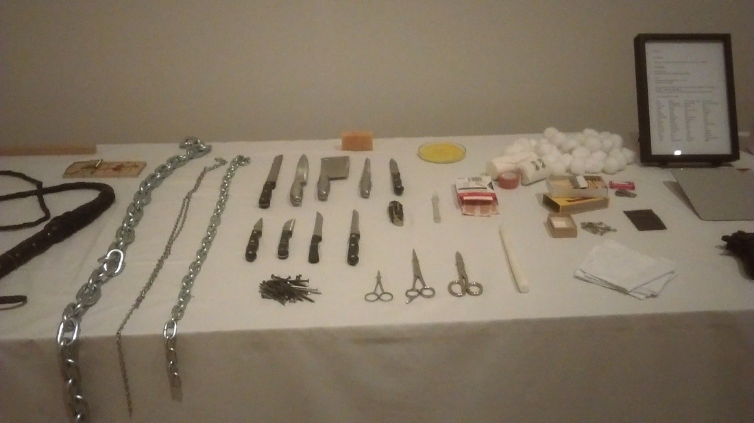
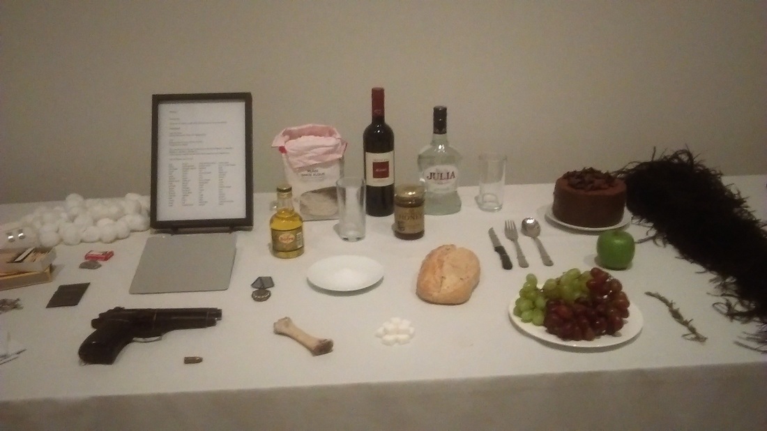
Marina Abramovic vs Todd McLellen

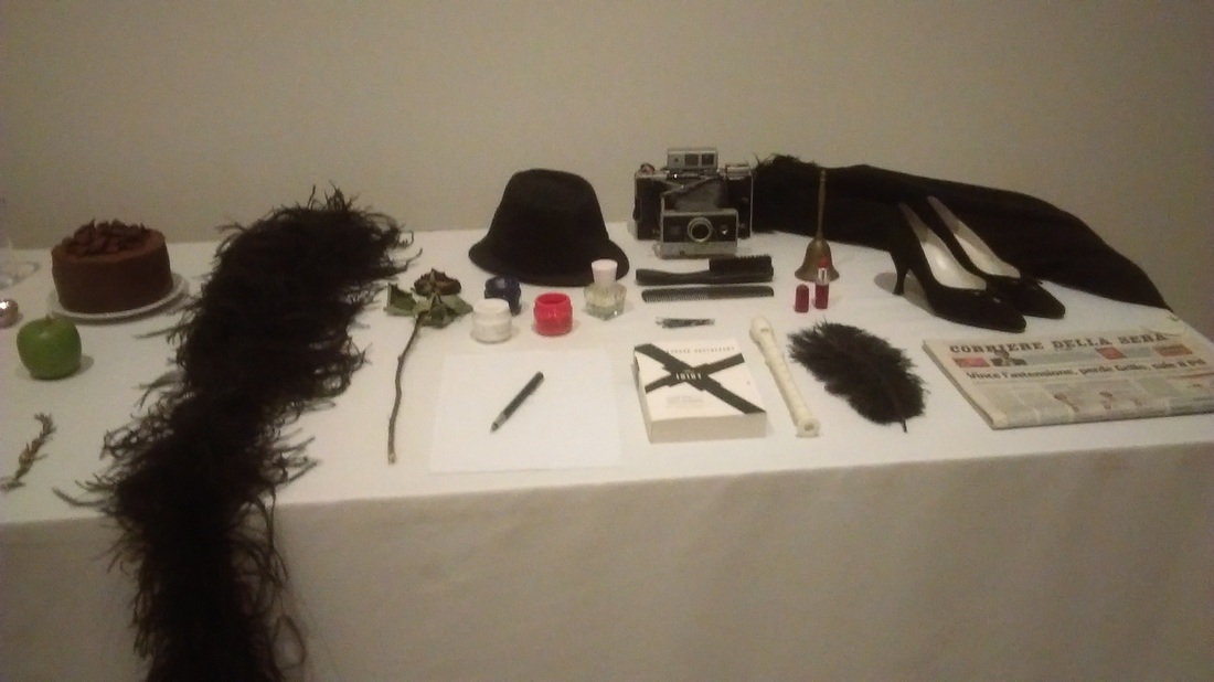
Marina Abramovic is a Serbian artist who is based in New York, Serbia and Nertherlands. This piece of work is called Rhythm 0 1974. Its a table with 72 objects placed in an ordely fashion.
McLellan intended to disassemble objects to create a messy, deconstructed way. He did this by taking apart off the different parts of an object and spreading them out in an orderly fashion. He wanted us to appreciate the complexity of deconstructing objects.
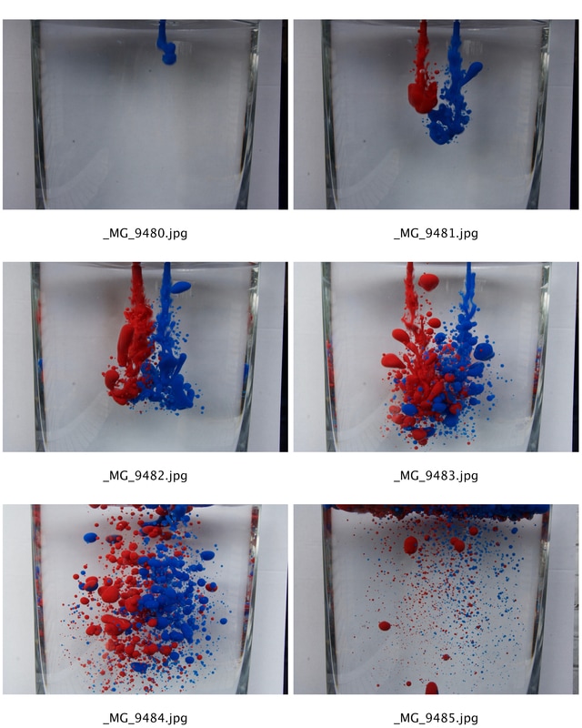
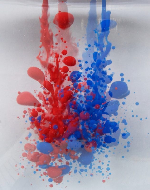
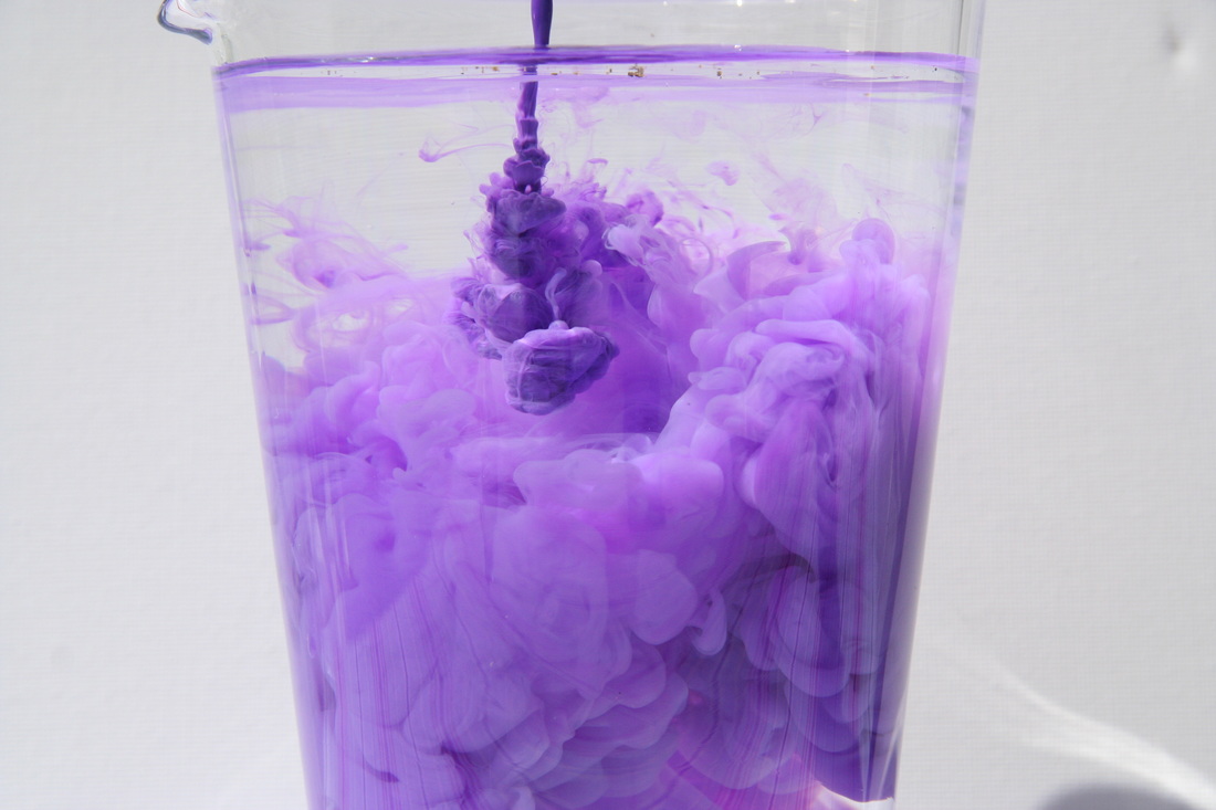
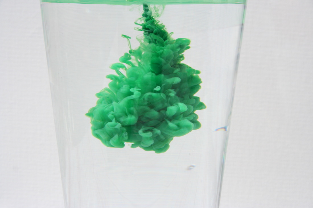
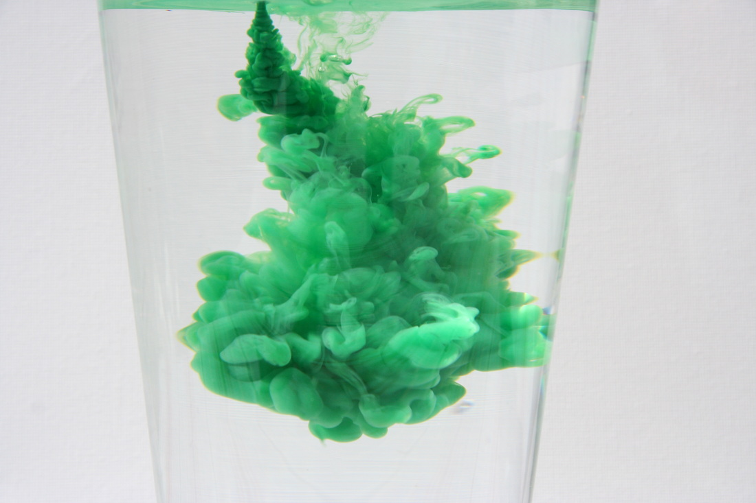
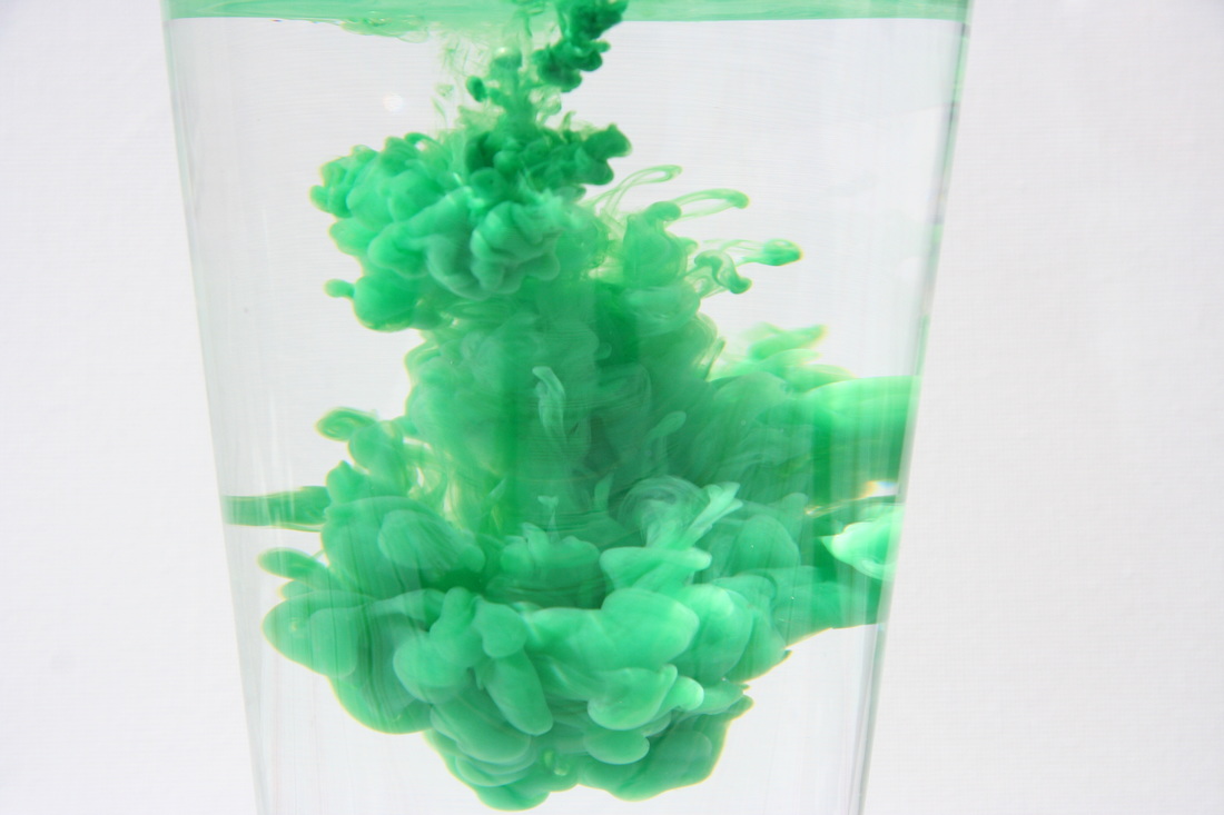
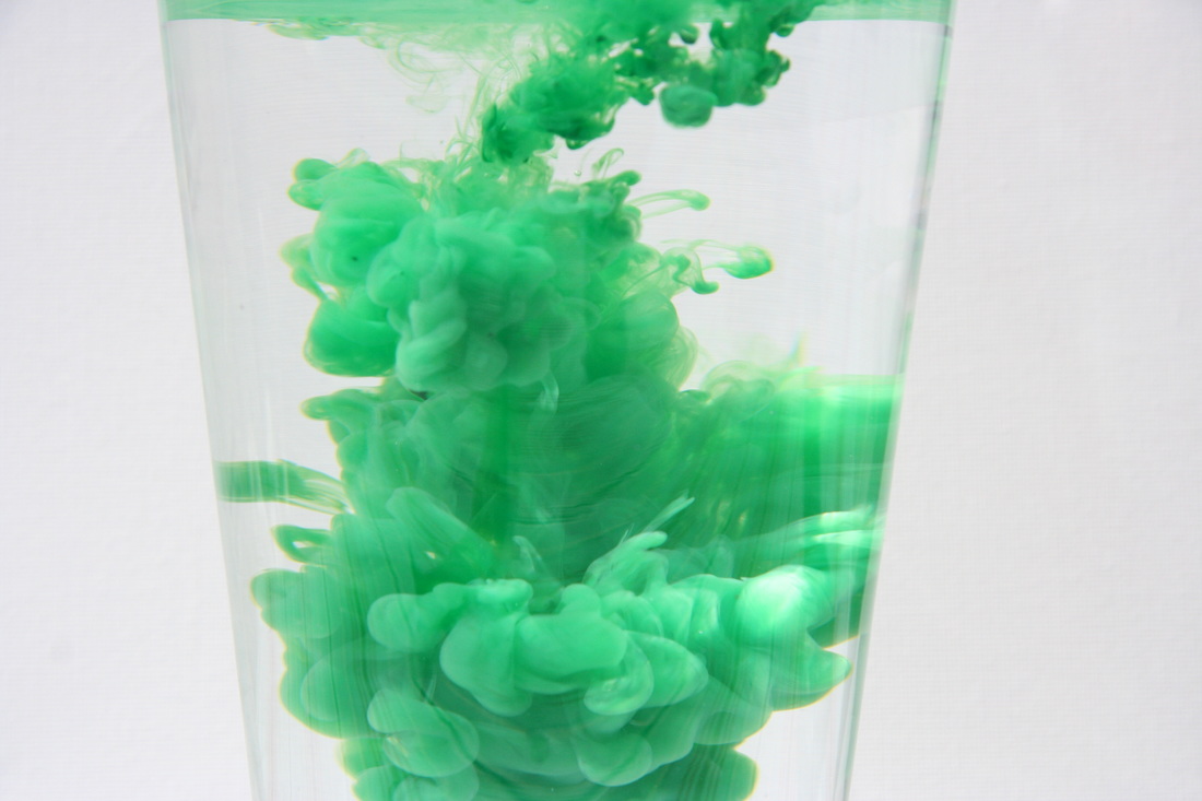
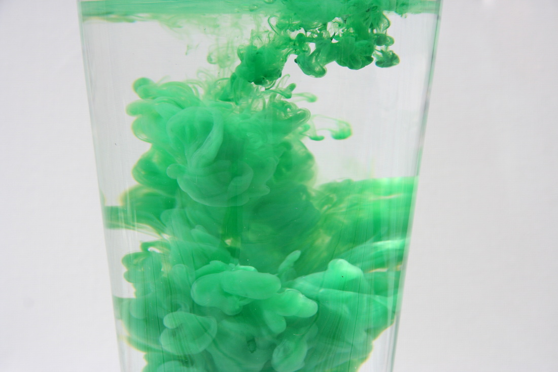
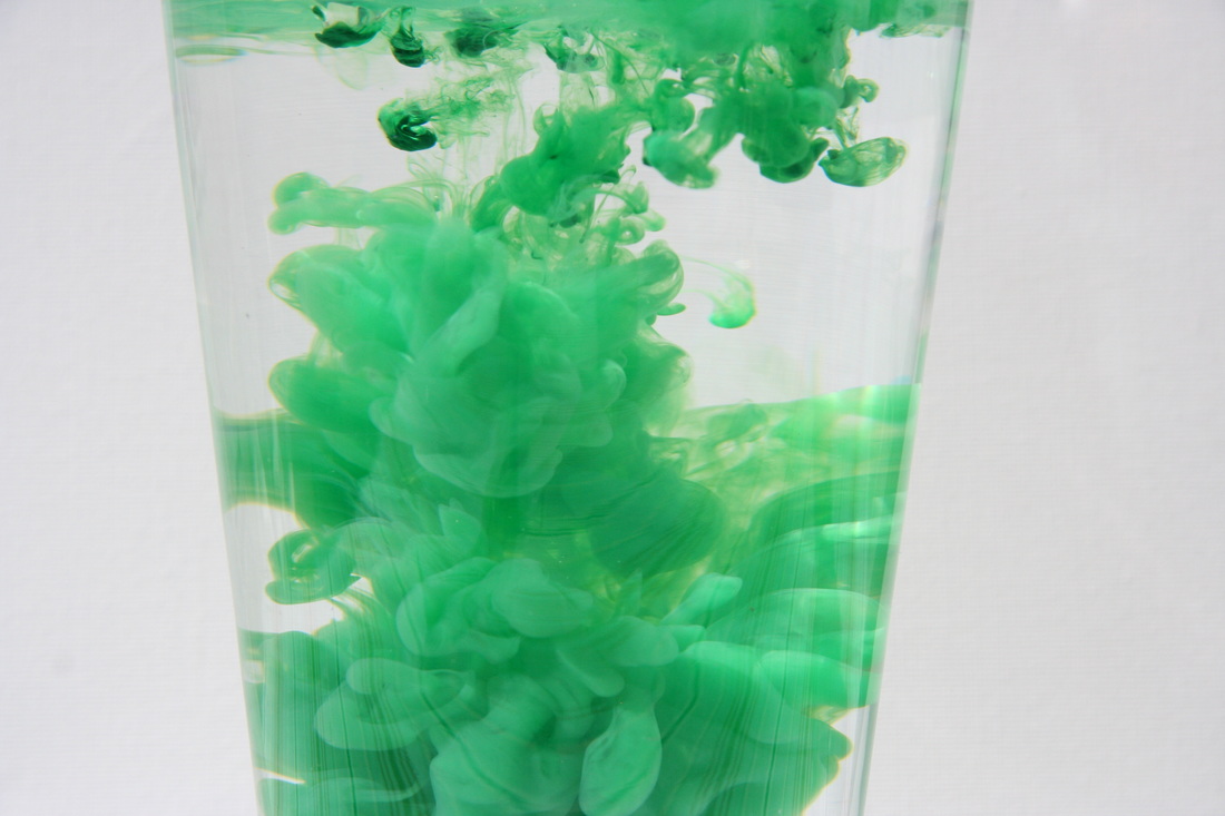
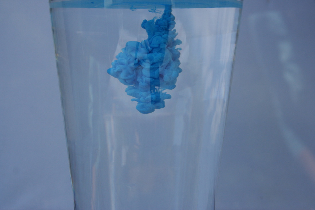
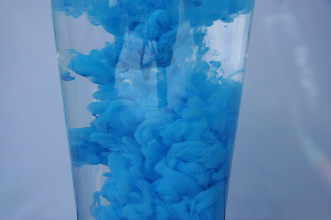
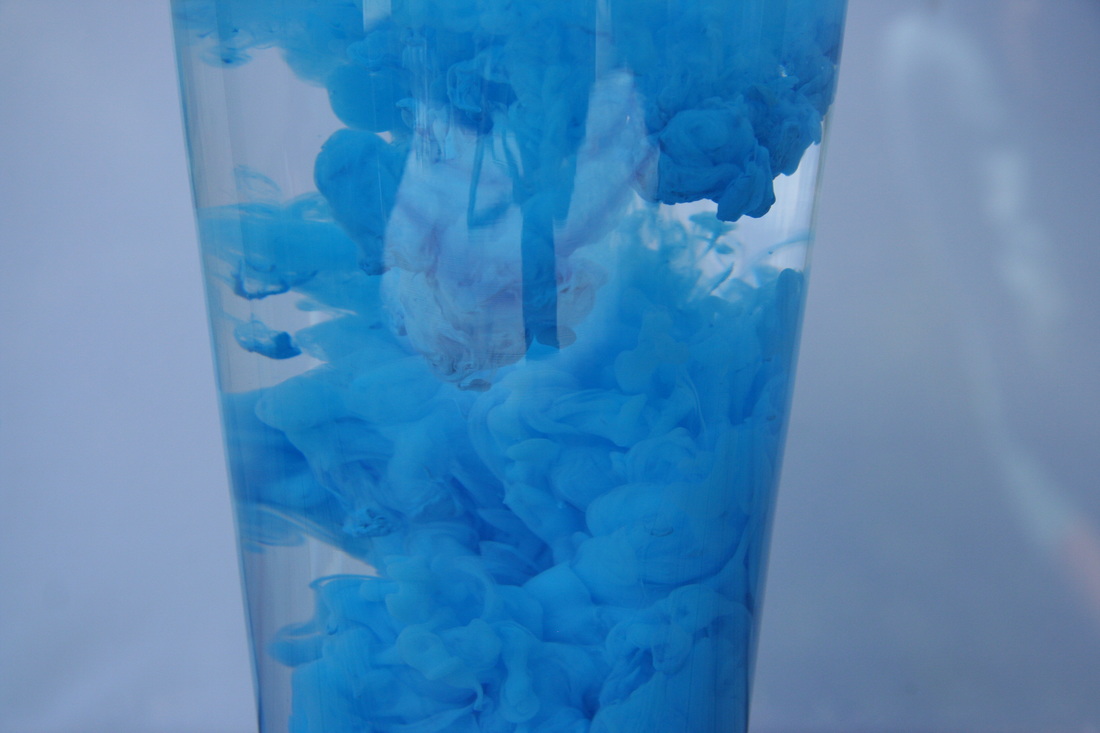
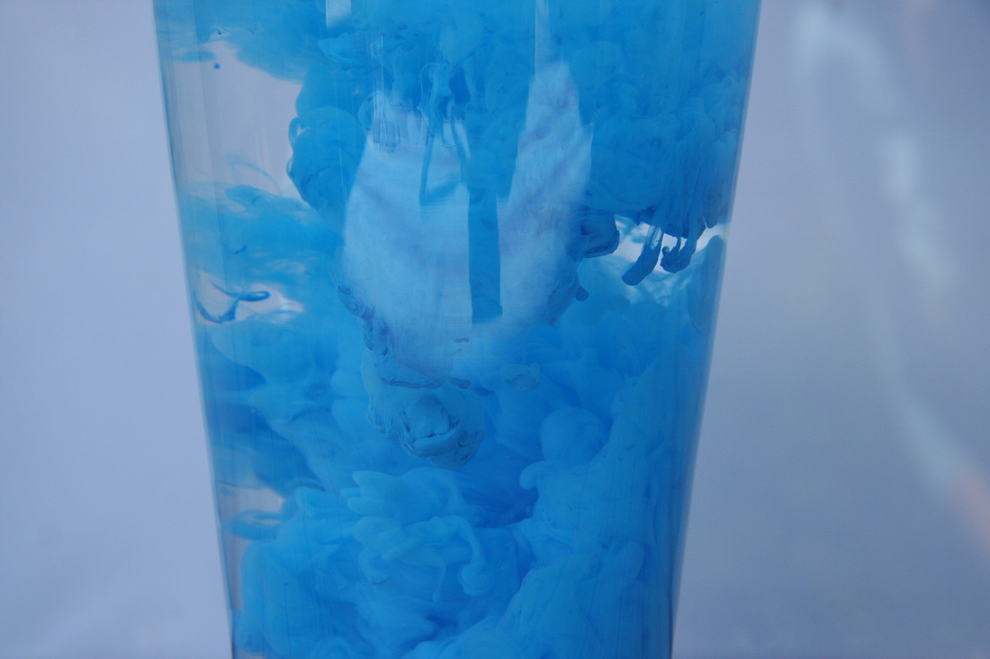
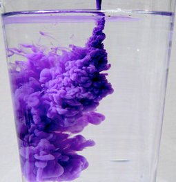
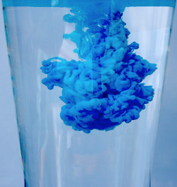
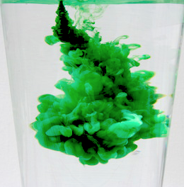
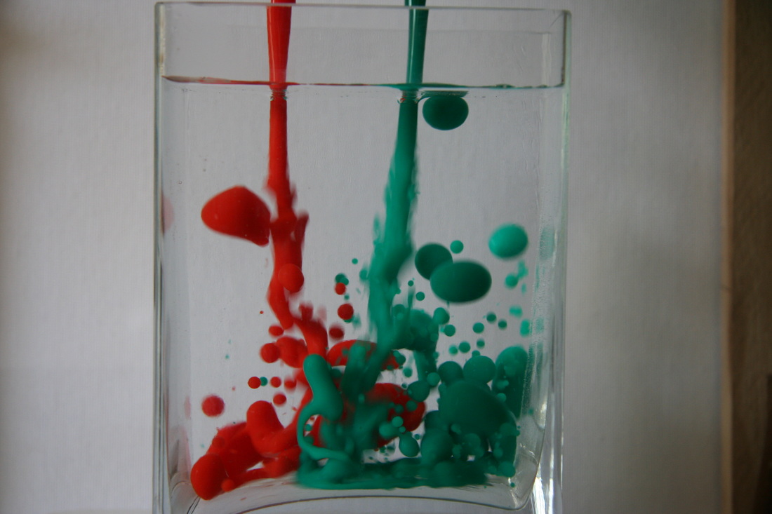
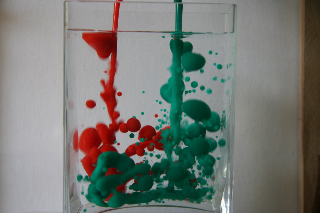
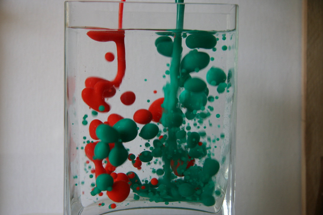
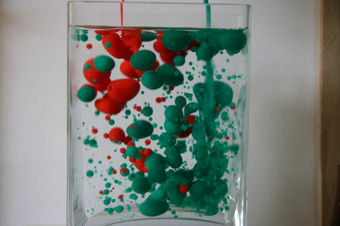
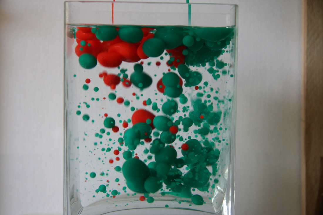
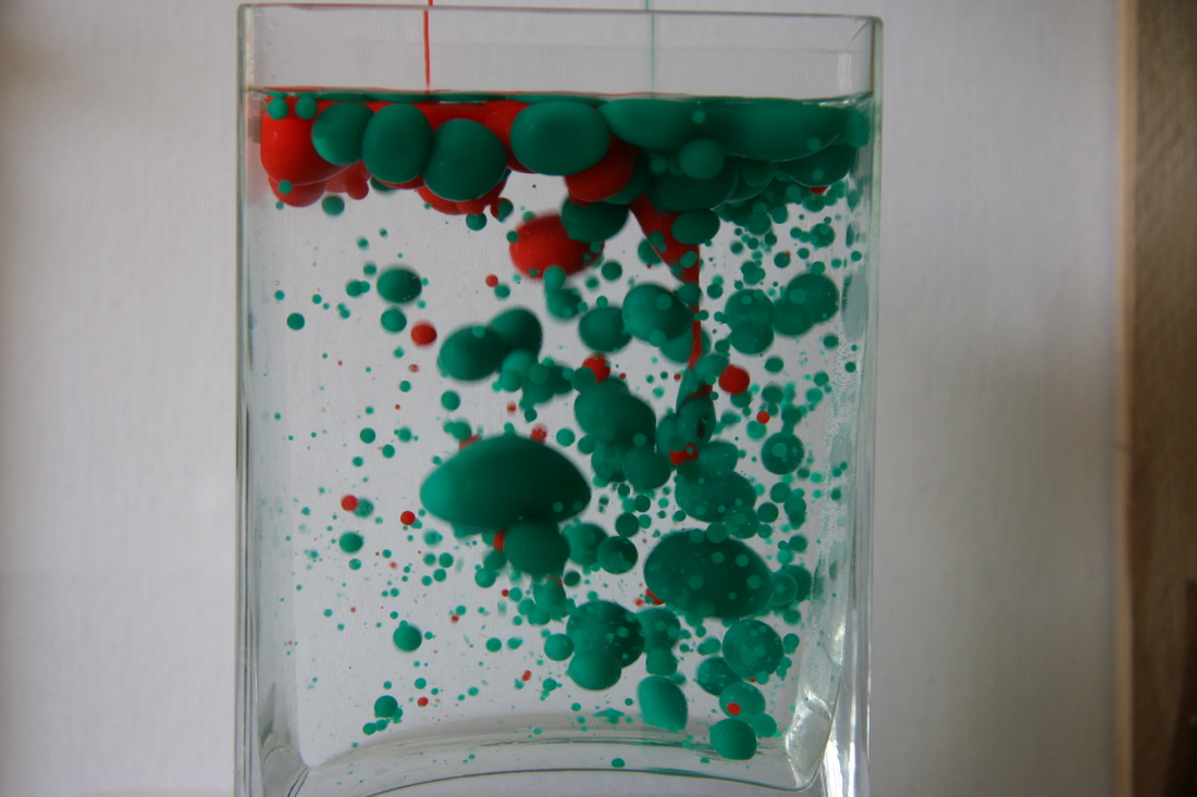
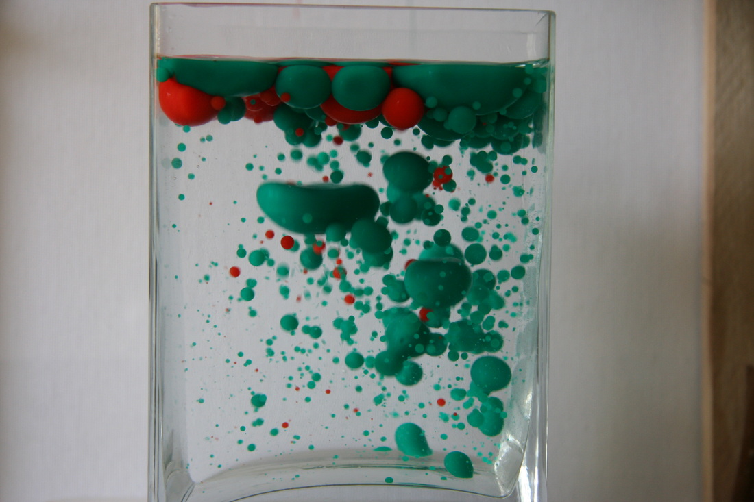
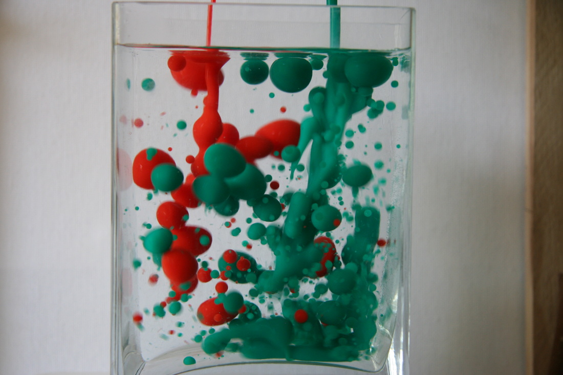
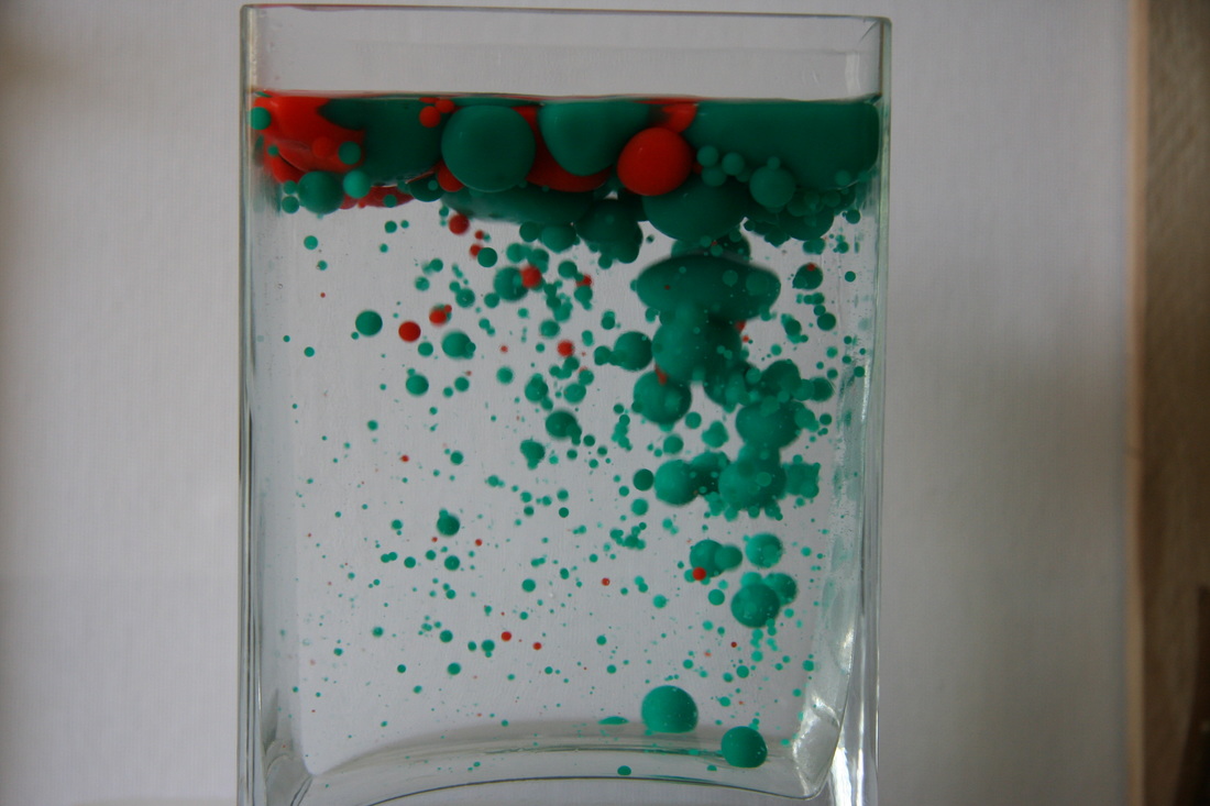
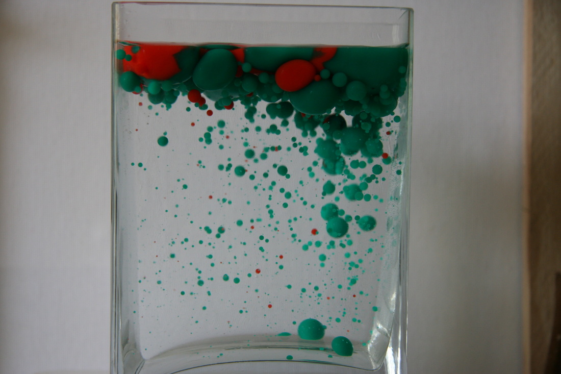
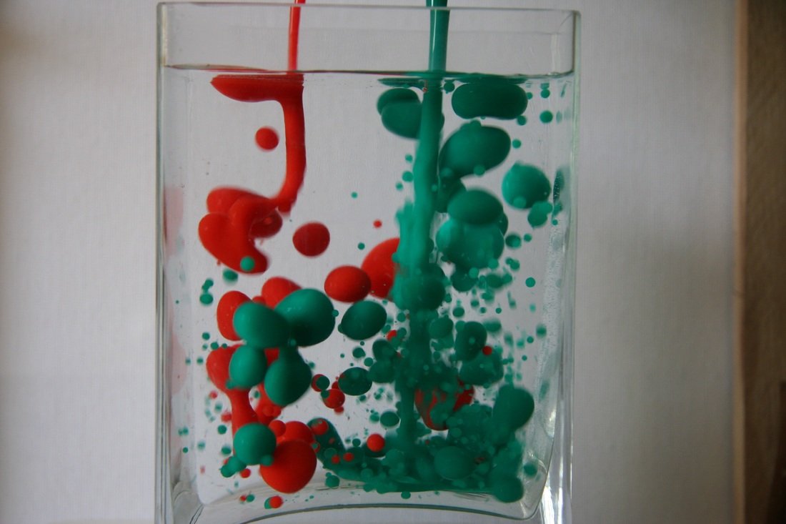
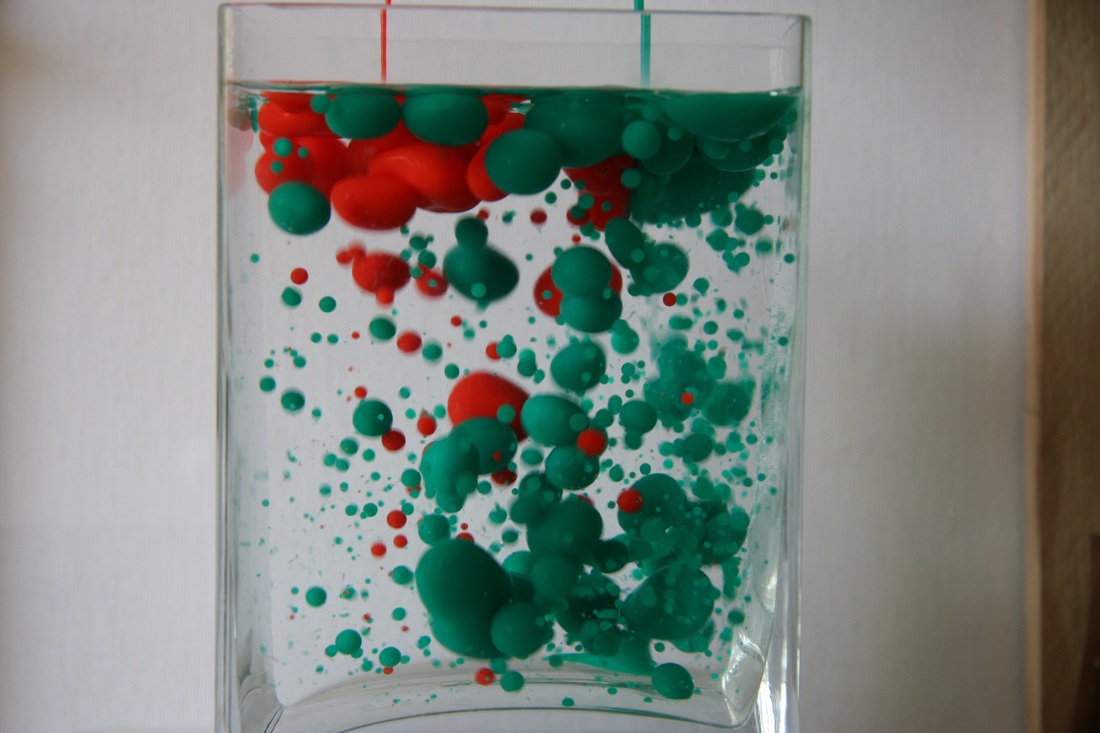
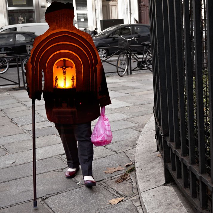
Chosen Final Strand: Force of Reactions
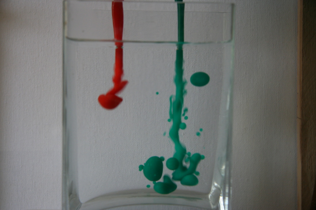
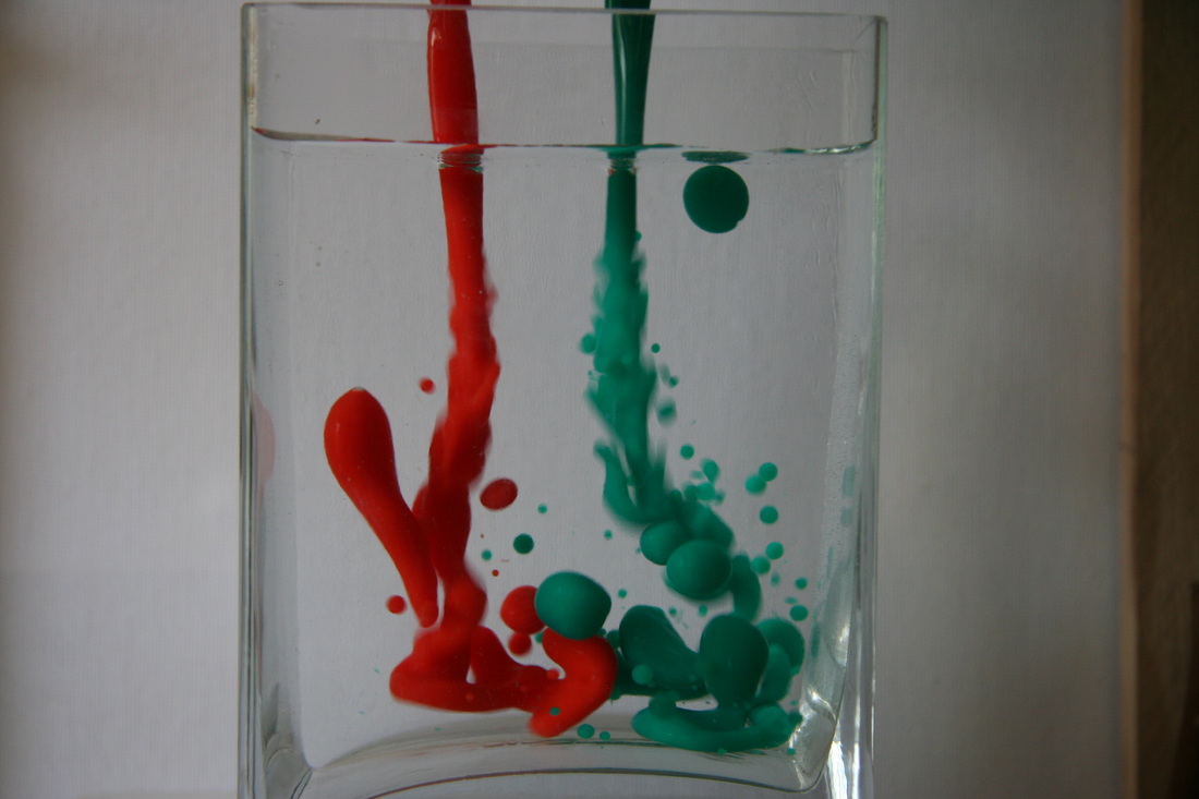
Development One: Multiple Colours
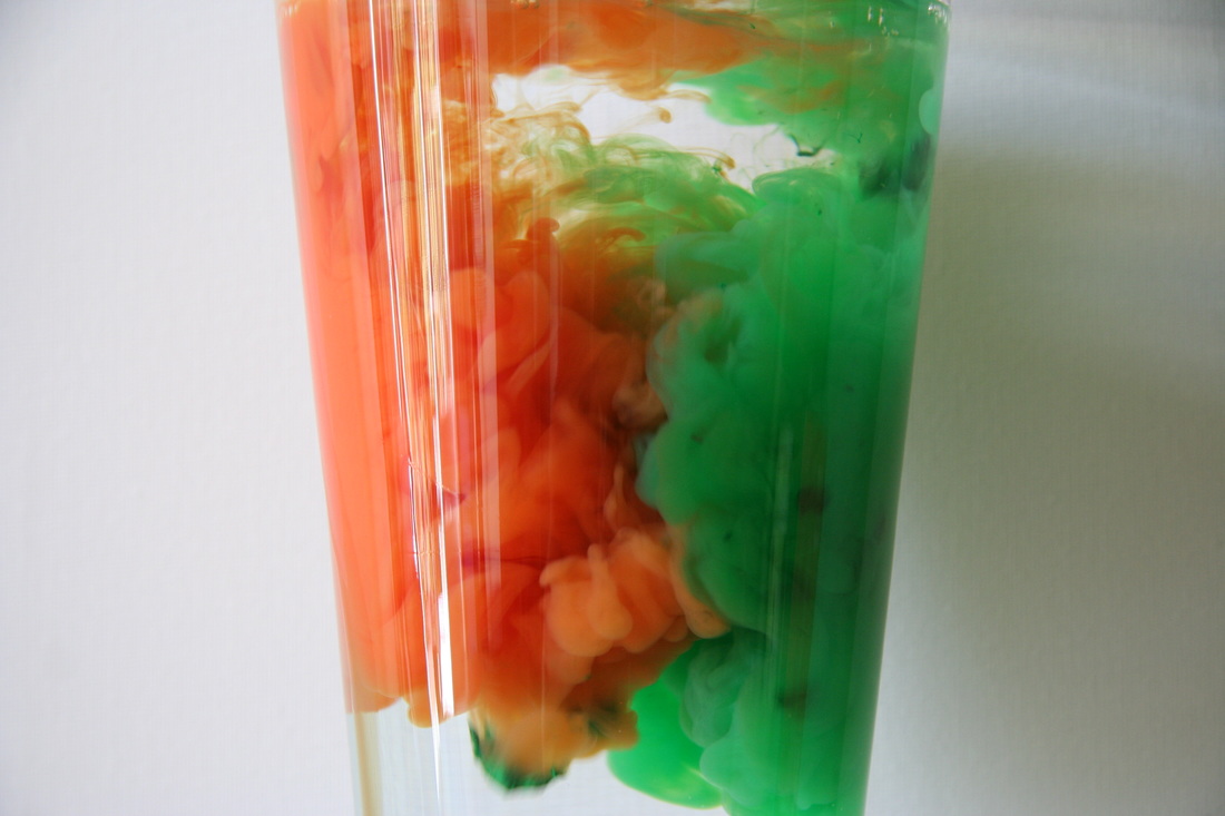
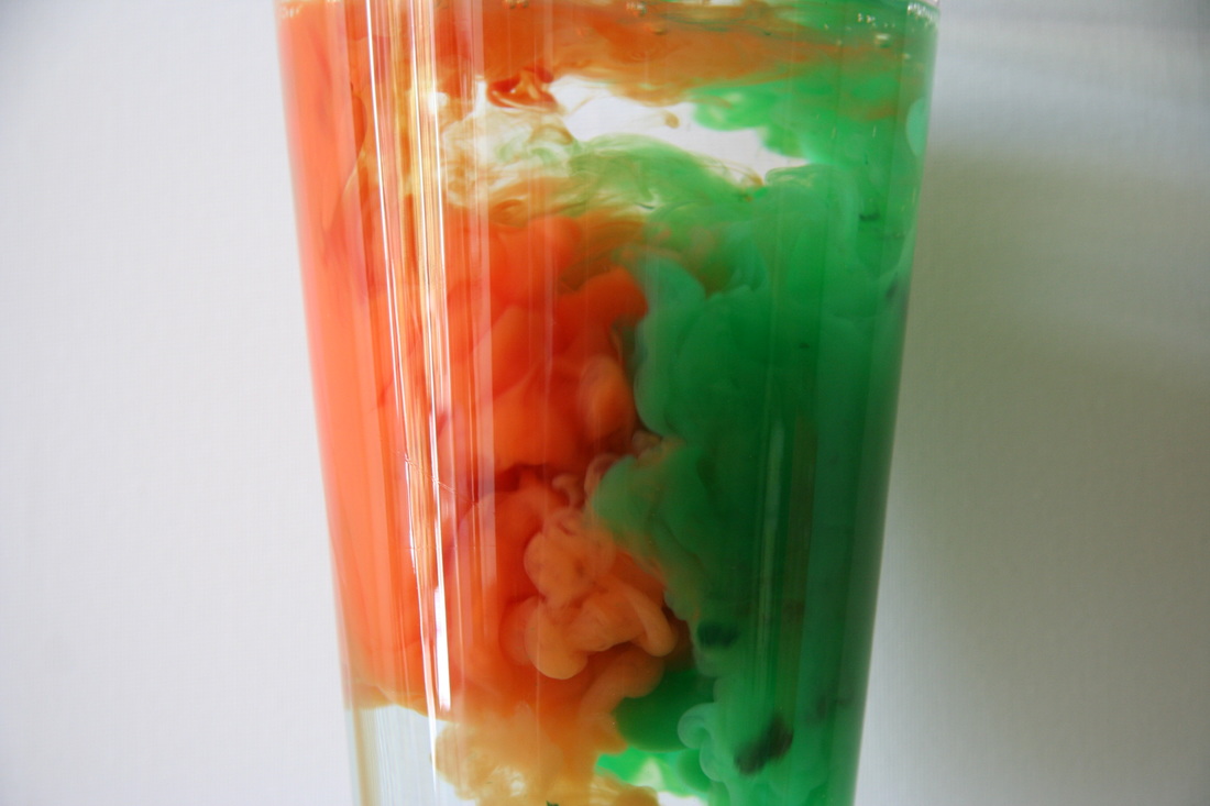
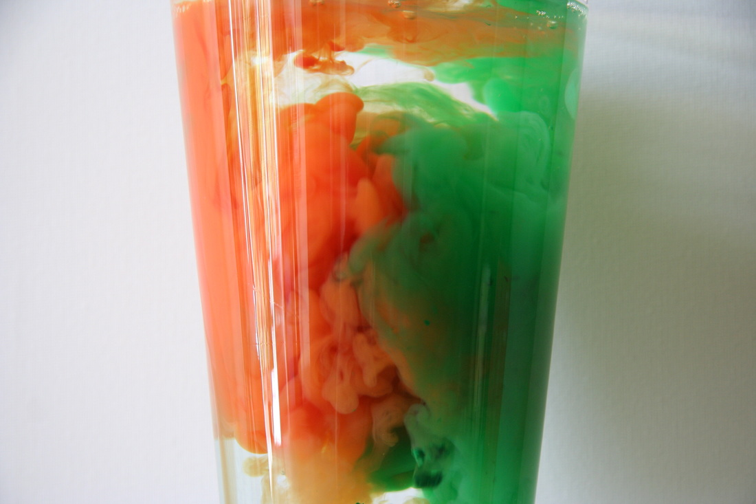
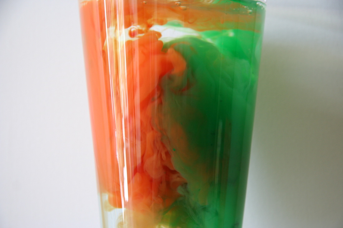
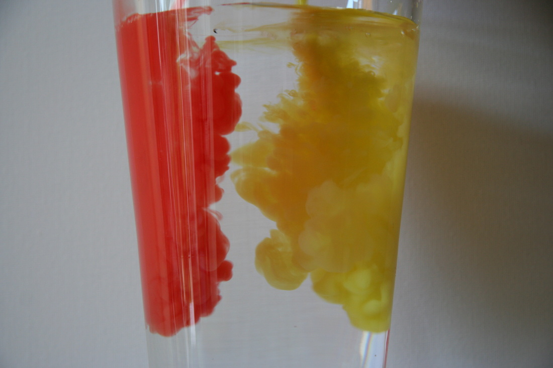
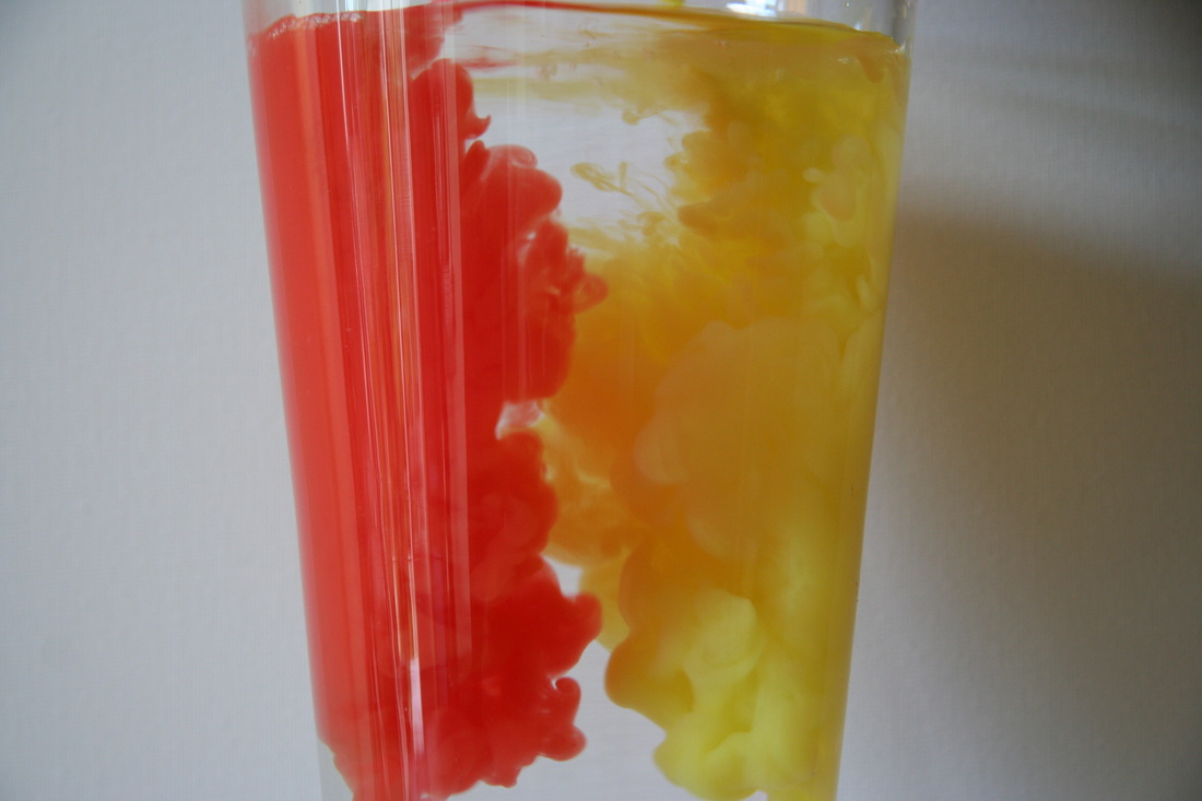
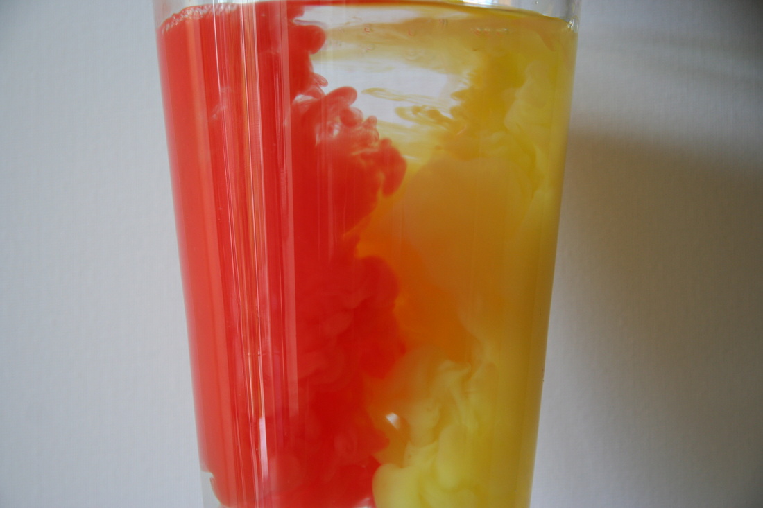
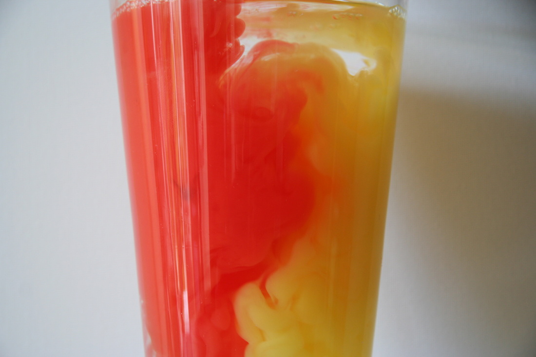
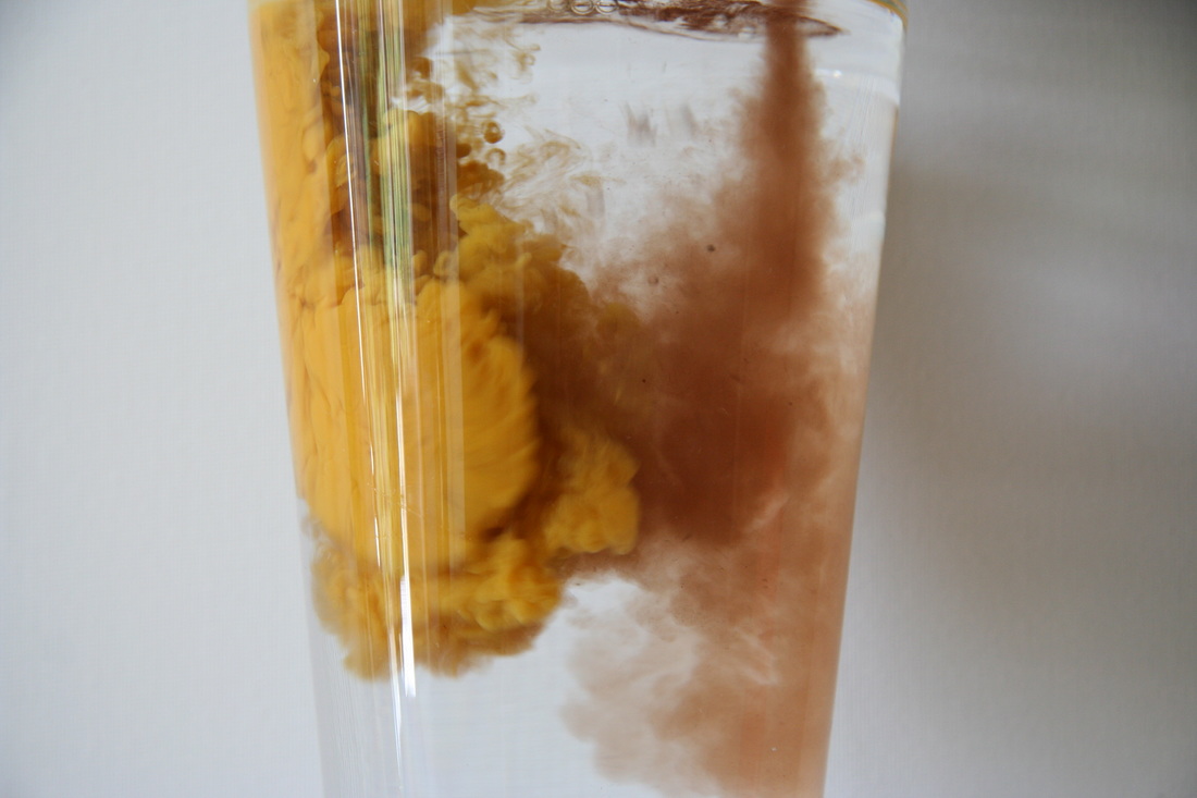
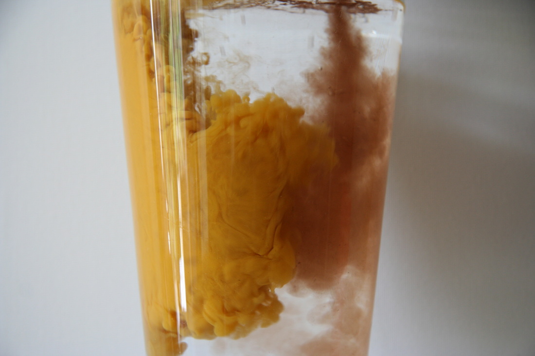
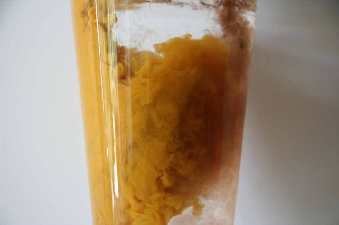
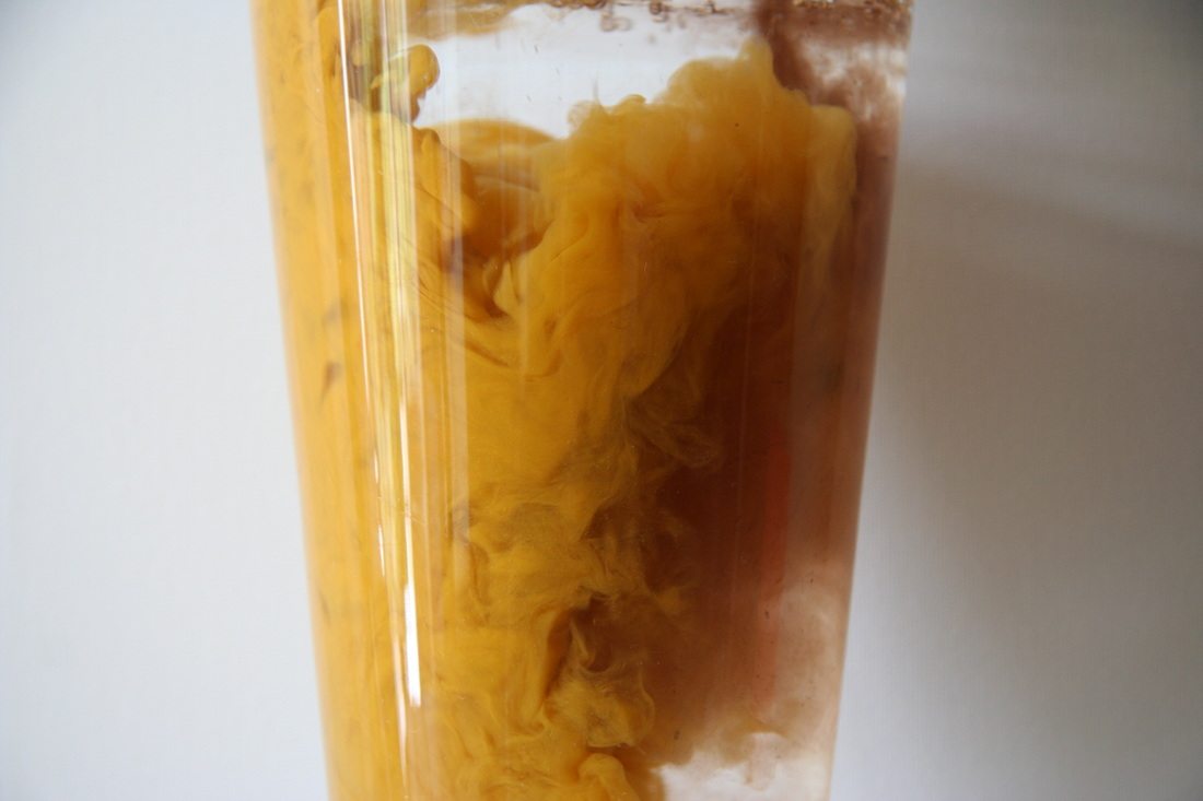
During this experiment, I personally think the more contrasting colours are better for this. For example, the orange and green mixes better than the yellow and brown.
Development Two: Household Items
Development Three: Oil vs Paint
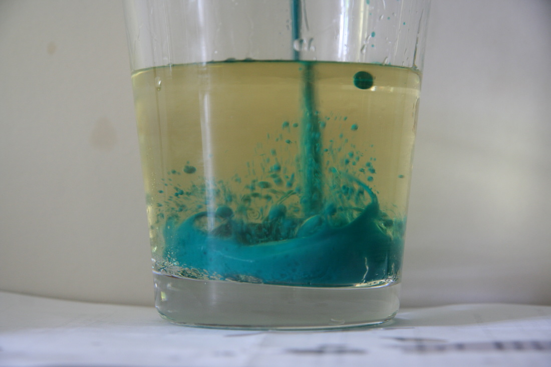

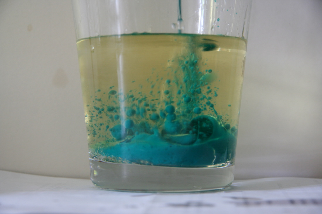

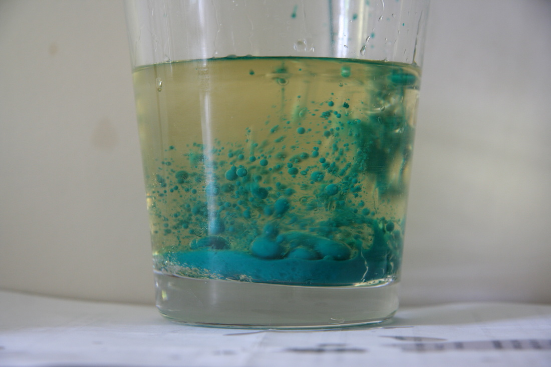
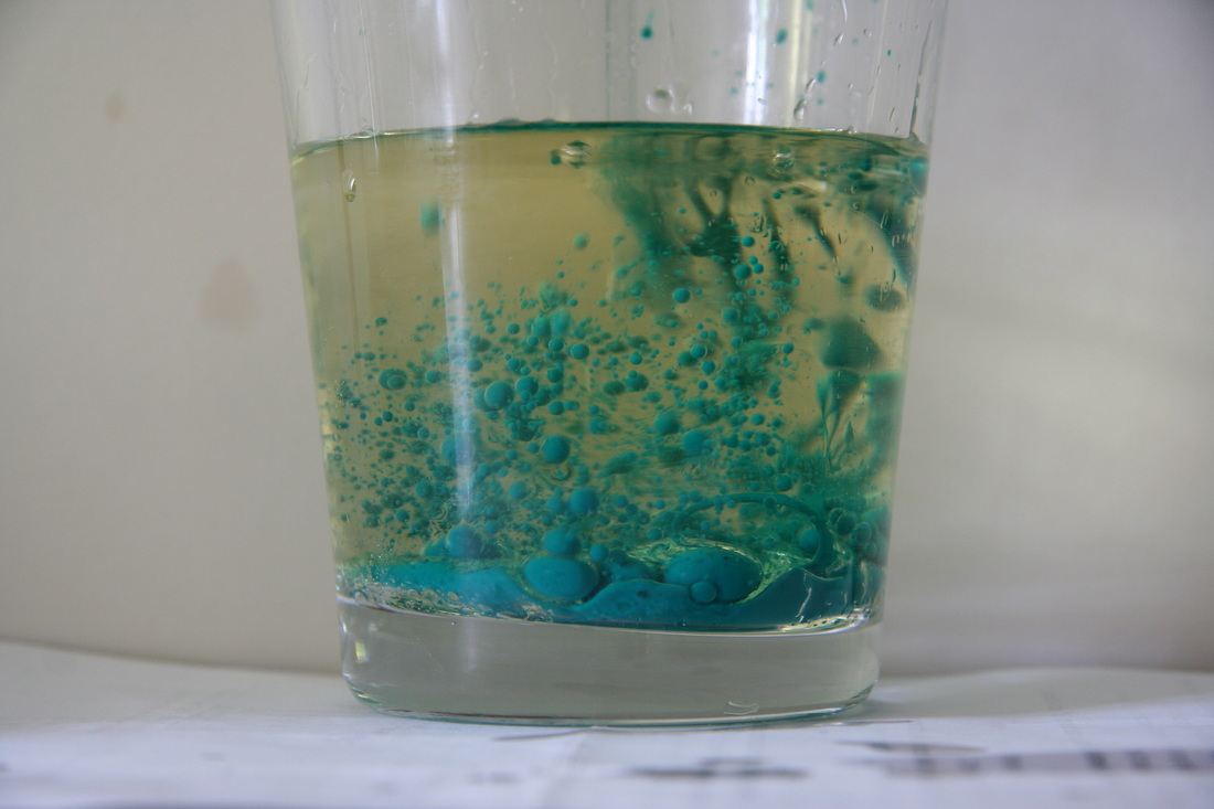
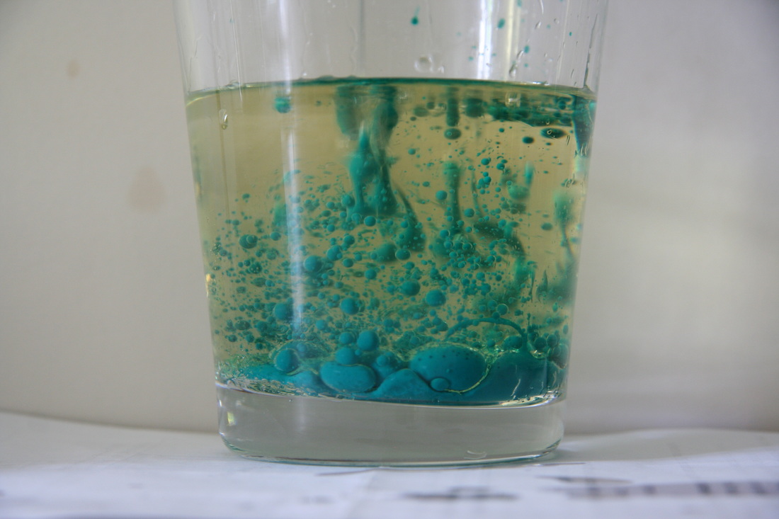
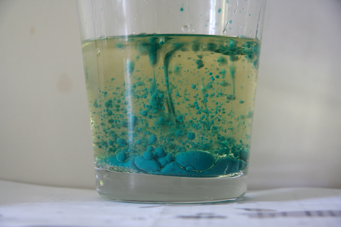
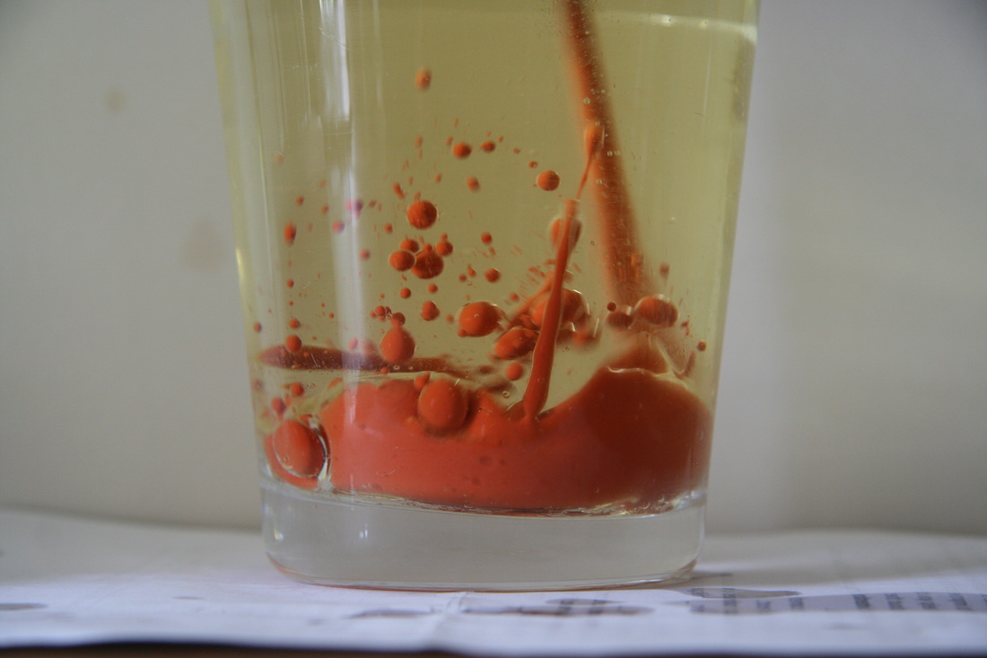
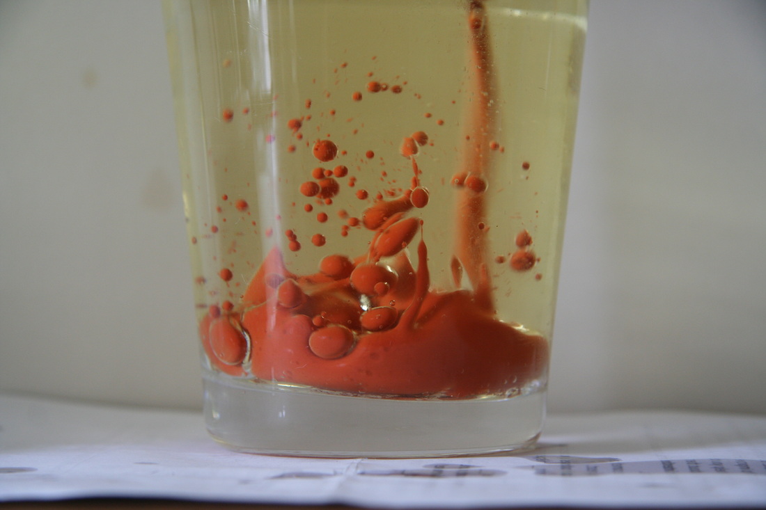
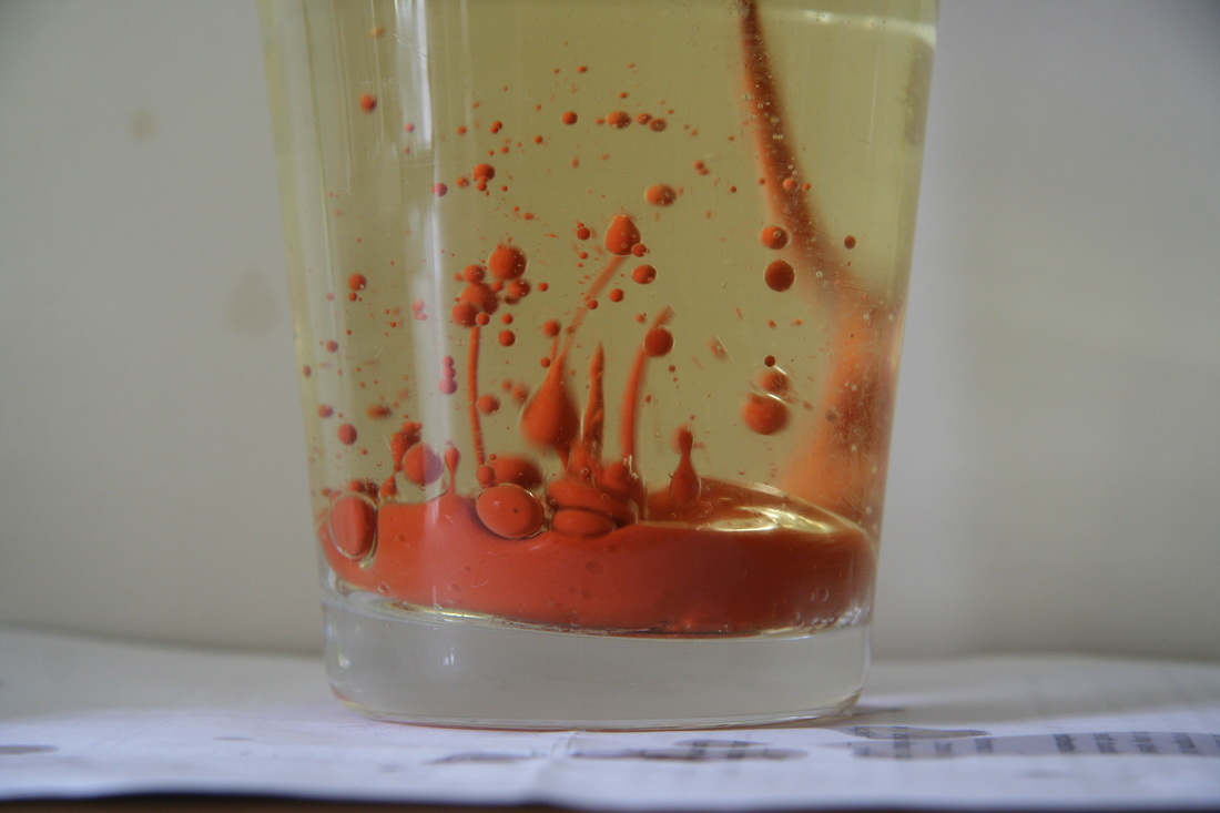
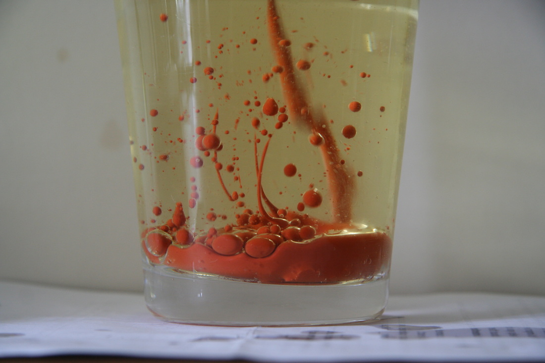
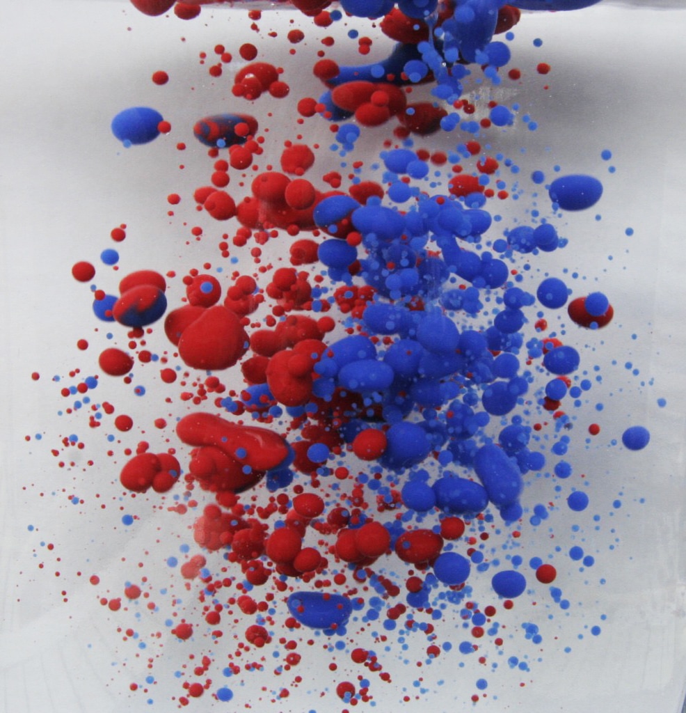
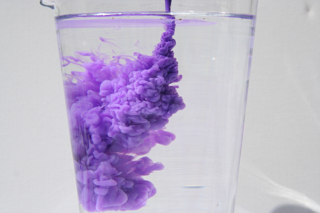
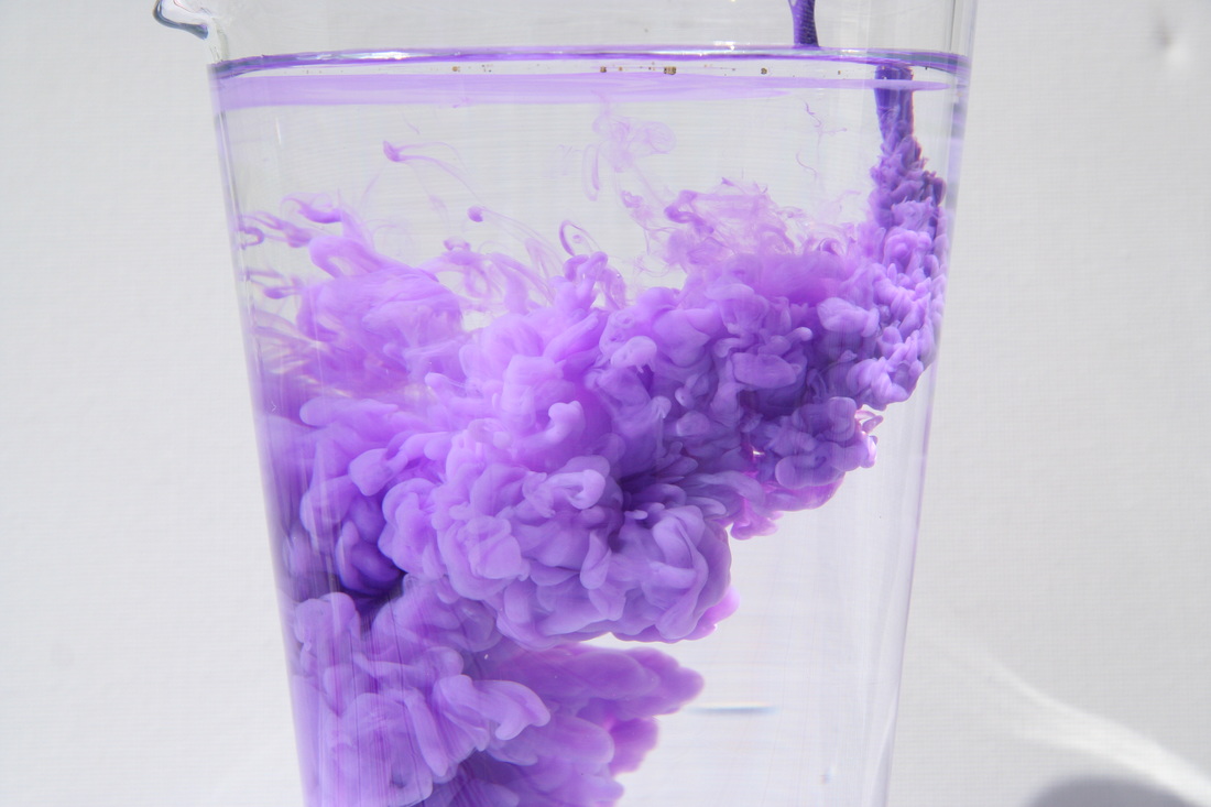
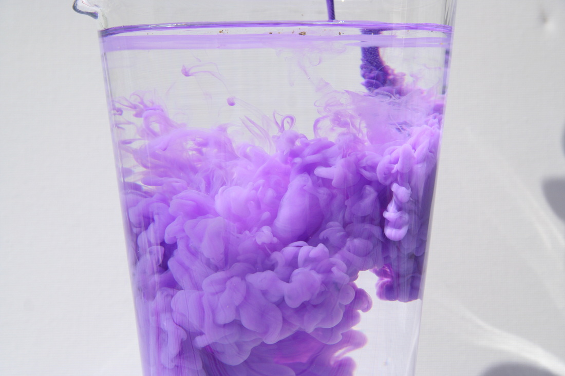
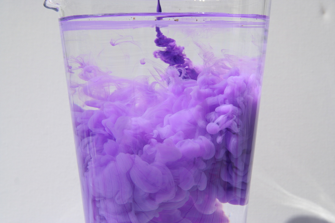
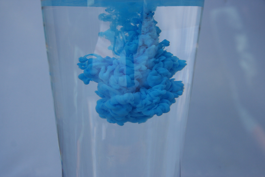
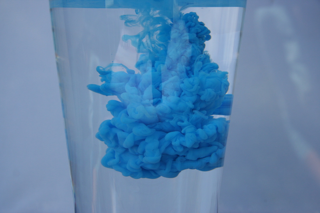
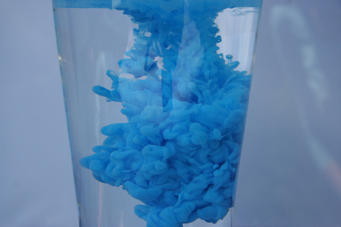
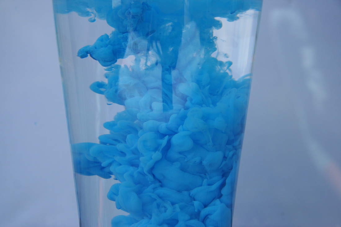
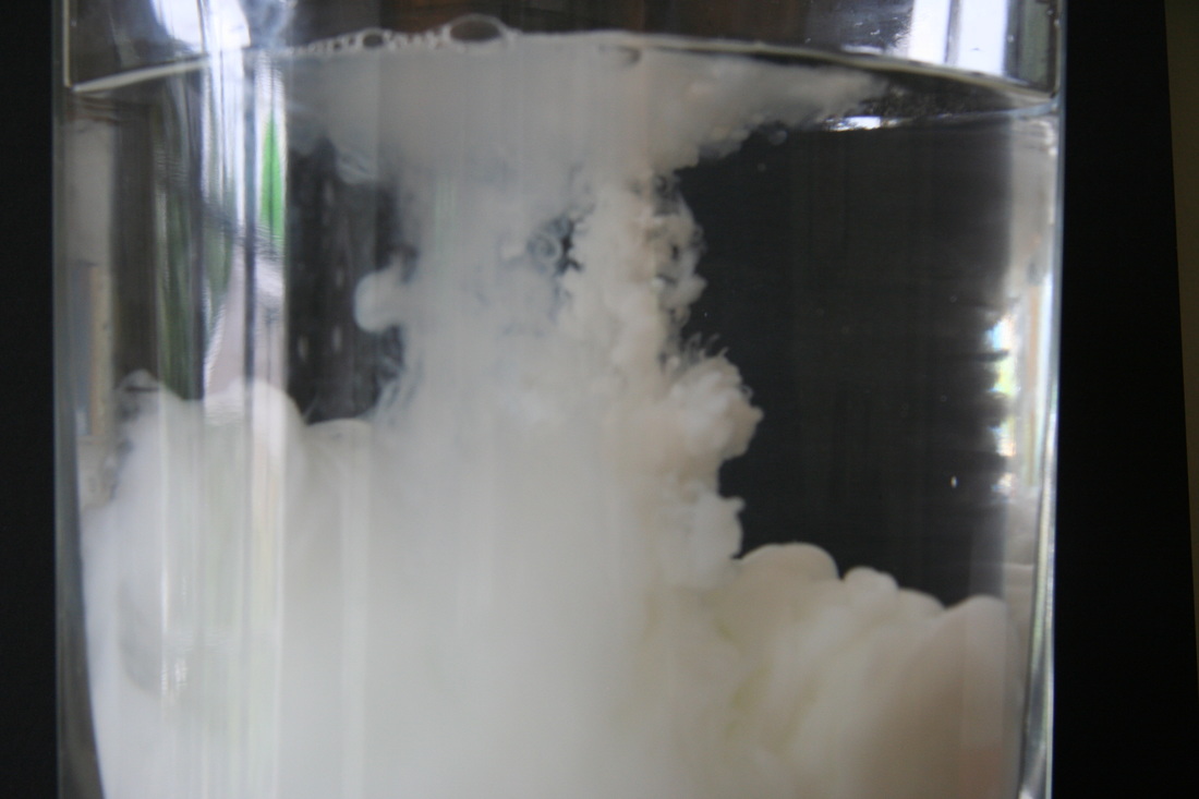
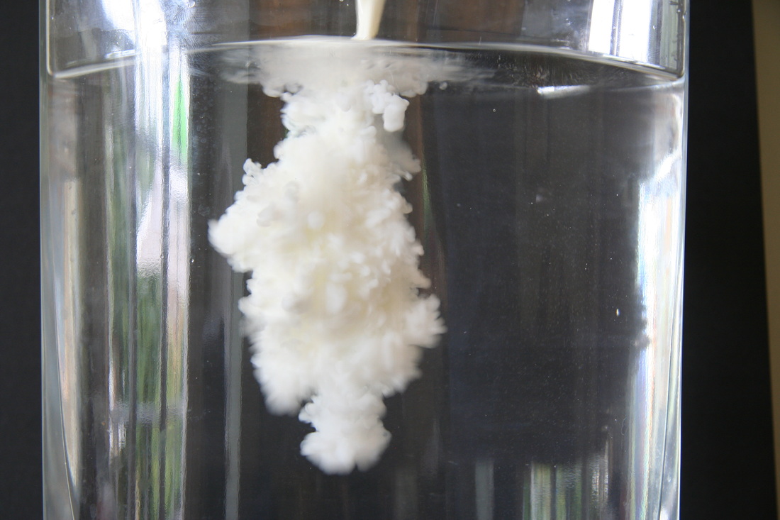
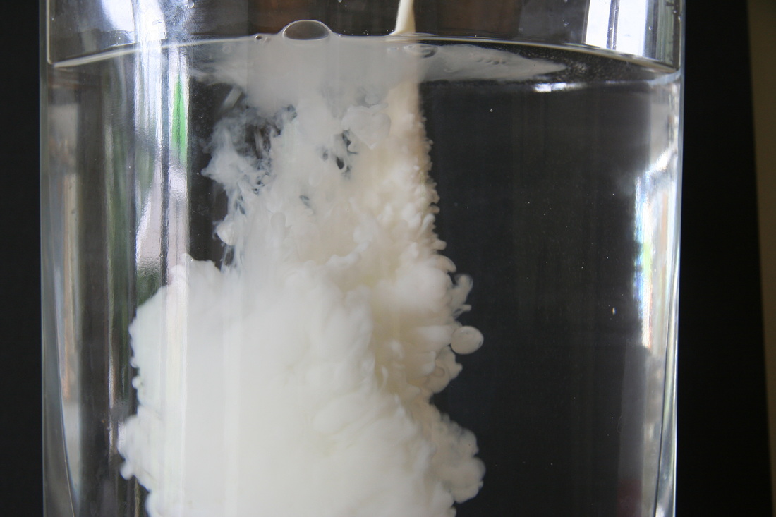
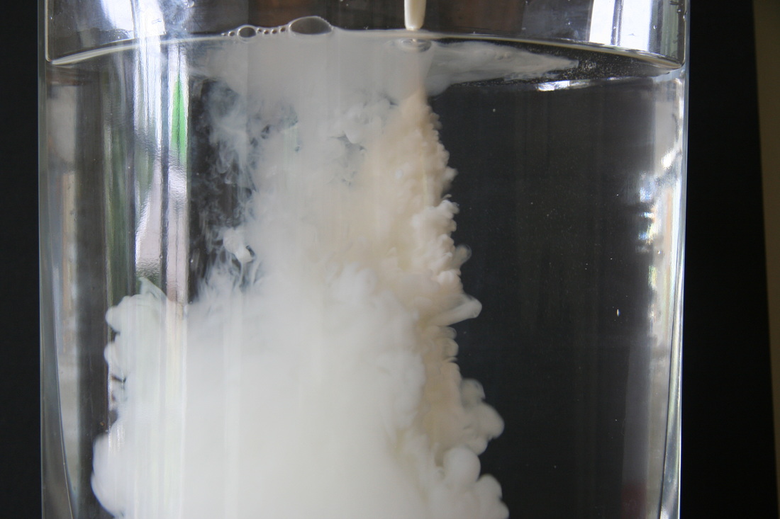
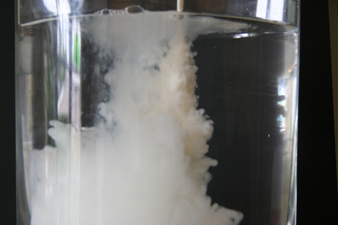
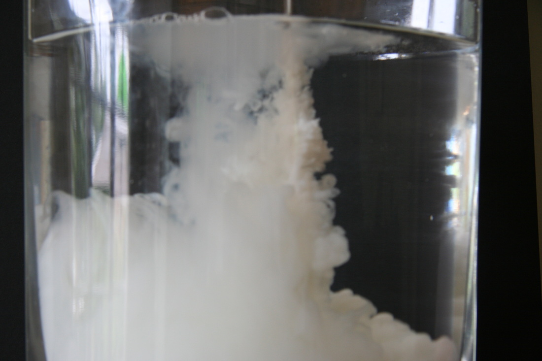
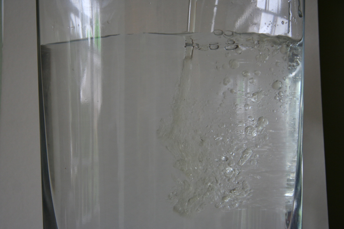
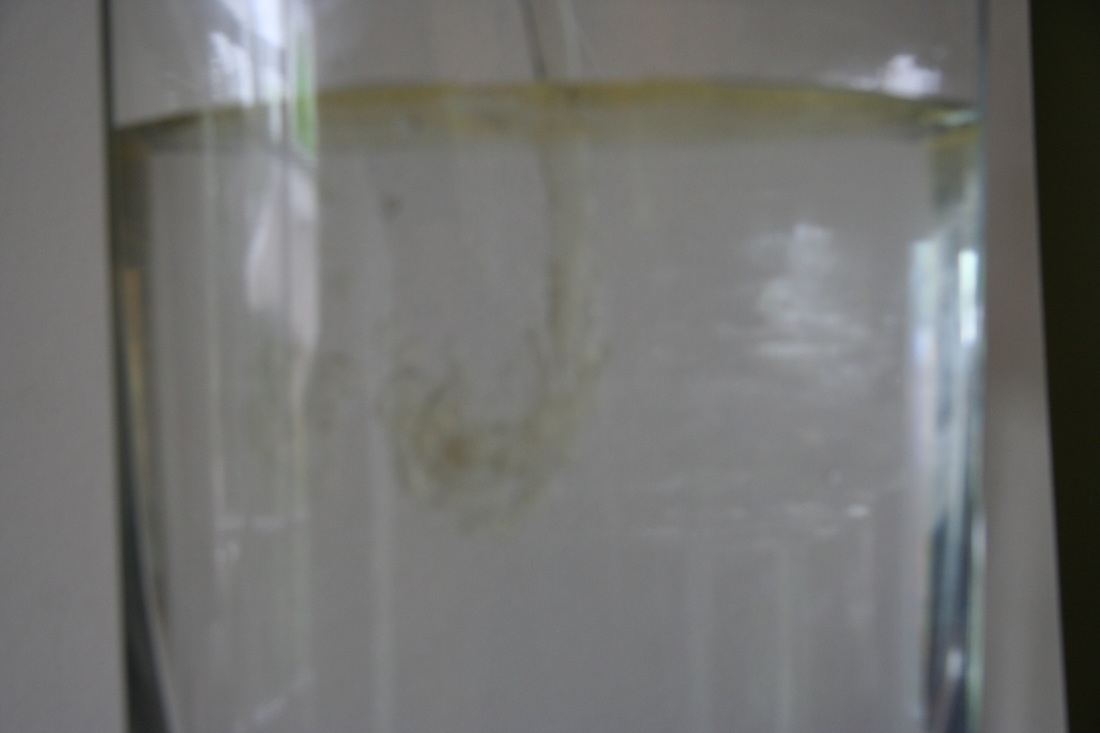
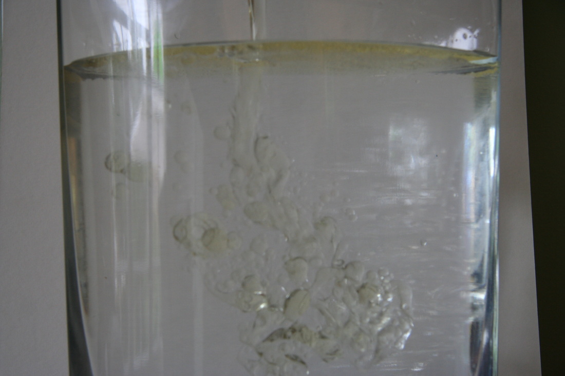
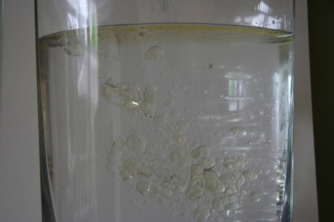
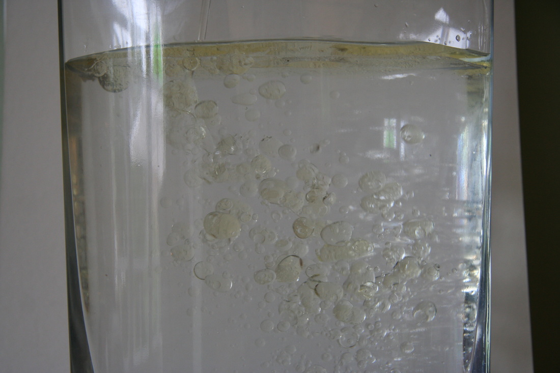
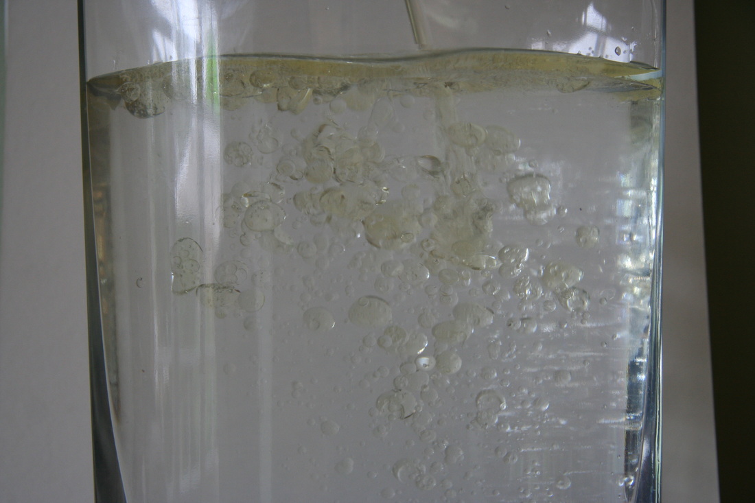
Development Four: Smaller Jar and Different Liquids
My Final Piece is going to be an double exposure. In my 4th development, I have experimented a variety of different things such as a different glass jar, different content and different pouring liquids. As you can see below, I have changed my jar to a smaller one to see if the outcome is better. I have also experimented with using hot water and oil paint mixed with pure oil to see if there is any difference.
As you can see from after the experimentation, I beleive that all changes have been very effective in a positive way. The jar I used was smaller, this way I can observe whats happening at the top of the jar as well as the bottom. The Oil Paint has created very creative bubbles in the water which looks good as well. After observing the changes, I've picked out my favourite four images over the whole of the development process (below) and I am going to double expose them.


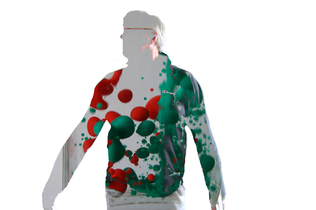
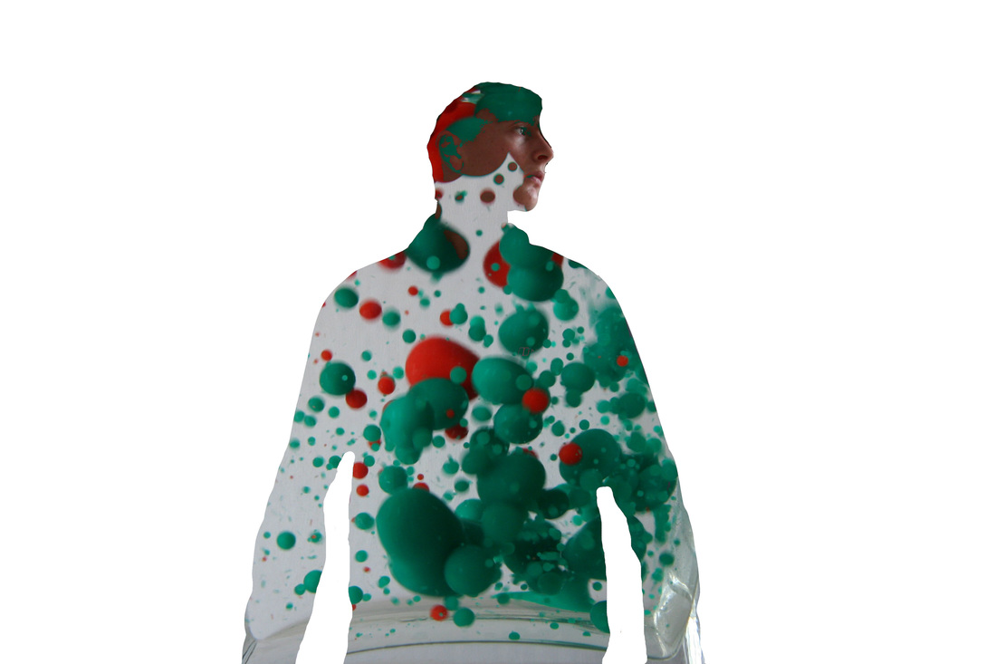
Final Piece Preperation
First Response
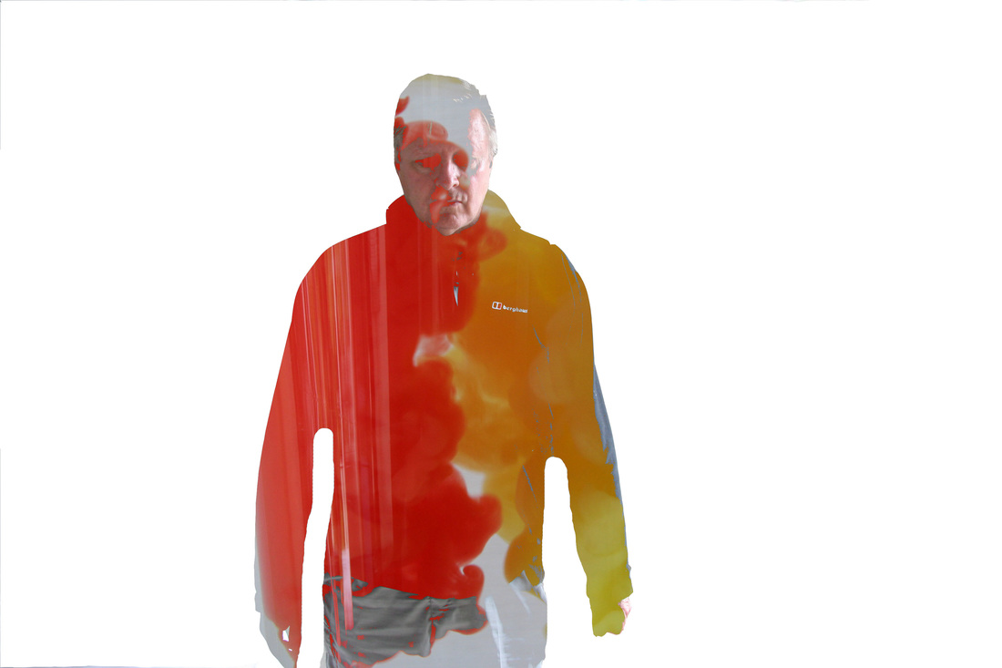
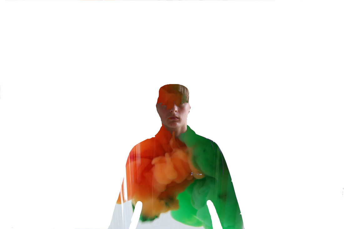
Second Response
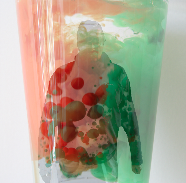
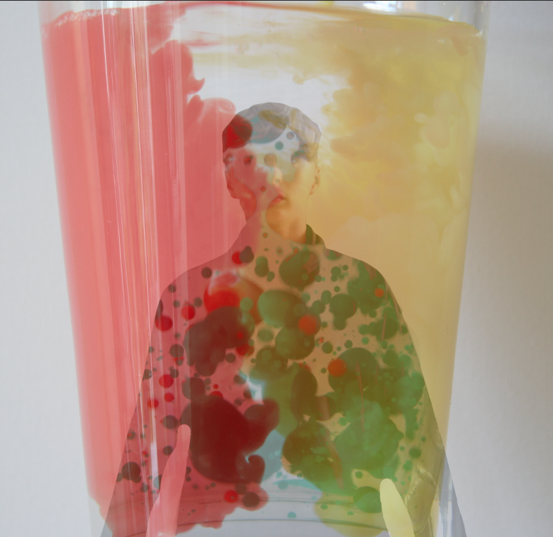
In these responses, I have experimented with photoshop to create an effective good looking double exposure. I have used the paint in water as the back ground for some and myself and my dad as bodies filled with bubbles from Development Four and paint in water from Development One.
Looking at my responses, I think for my Final Piece, I'm going too use better people to model and for them to move in different positions. I may also add better contrasting oil bubbles into water to make the final piece look more effective.
During the responses, WWW: I think that I used a good range of colours to put all together into one image. I also think that the oil bubbles worked very well. EBI: This piece would be even better if I focused more on making the final piece look more professional and accurate. By this I mean finding new photoshop methods to make this piece look more in detail and sharp.
Artist Analysis - Nacho Ormaechea
Final Piece